Tutorial
Click on thumbnailed images to enlarge
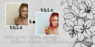
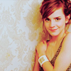
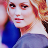
How to turn this: 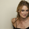 to this:
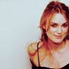
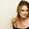
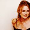
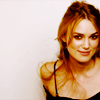
1. We'll start off by opening an image. I used one of the amazing Keira Knightley, courtesy of here. Crop it to your liking. I think this coloring works best with bright to semi-bright celebrity photoshoot photos. To avoid confusion, try using the same image that I'm using.
2. Duplicate your base. Now set the first copy ("Layer 1 copy" or "Background copy") to Screen at 62% opacity. If your picture is already bright, you can lower the opacity. Make sure it's in between 20% to 70%. This basically brightens up your picture, you'll also see why in the next step.
>> 
3. Duplicate your base one more time. Drag it all the way to the top and set it to Soft Light at 100%. This adds some contrast to your image, and the screen we did in the last layer helps tone it out.
 >>
>> 
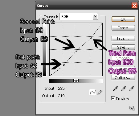
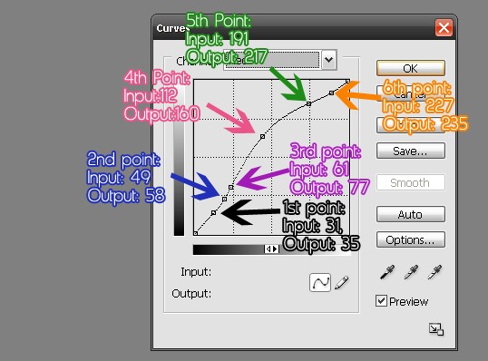
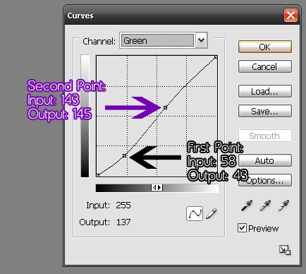
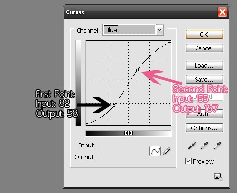
4.Go to Layers >> Adjustment Layers >> Curves. The Curves window will pop up.To make a point, press anywhere in the grid, and put the numbers in the little white boxes that appear in the bottom of the grid. Follow my settings:
Channel: RGB
Channel: Red
Channel: Green
Channel: Blue
This adds some warm red color to it. It will look like this now:
5. Go to Layers >> Adjustment Layers >> Color Balance. The Color Balance window will pop up. Follow my setting:
Midtones: -30 +13 +17
Shadows: +27 +16 -15
Highlights: -8 -13 -2
This makes the red a bit more subtle by adding a touch of yellow. It will look like this now:
6. Go to Layers >> Adjustment Layers >> Channel Mixer. The Channel Mixer window will pop up. Follow my settings:
Output Channel: Red
Red: +110
Green: -24
Blue: -4
Output Channel: Green
Red: +14
Green: +88
Blue: -6
Output Channel: Blue
Red: +32
Green: -2
Blue: +68
This gives the image more blue. It should now look like this:

7. Go to Layer >> New Fill Layer >> Solid Color. Choose #282c6f and set to Exclusion at 10%. This makes it a tad darker.
>> 
8. Go to Layer >> New Fill Layer >> Solid Color. Choose #fe619c and set to Soft Light at 25%. This adds a pink touch to the icon.
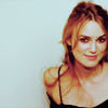
Your Final Icon:
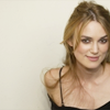
Other Results using different pictures:


More Sweet Tutorials?
to this: 1. We'll start off by opening an image. I used one of the amazing Keira Knightley, courtesy of here. Crop it to your liking. I think this coloring works best with bright to semi-bright celebrity photoshoot photos. To avoid confusion, try using the same image that I'm using.
2. Duplicate your base. Now set the first copy ("Layer 1 copy" or "Background copy") to Screen at 62% opacity. If your picture is already bright, you can lower the opacity. Make sure it's in between 20% to 70%. This basically brightens up your picture, you'll also see why in the next step.
>> 3. Duplicate your base one more time. Drag it all the way to the top and set it to Soft Light at 100%. This adds some contrast to your image, and the screen we did in the last layer helps tone it out.
>> 4.Go to Layers >> Adjustment Layers >> Curves. The Curves window will pop up.To make a point, press anywhere in the grid, and put the numbers in the little white boxes that appear in the bottom of the grid. Follow my settings:
Channel: RGB
Channel: Red
Channel: Green
Channel: Blue
This adds some warm red color to it. It will look like this now:
5. Go to Layers >> Adjustment Layers >> Color Balance. The Color Balance window will pop up. Follow my setting:
Midtones: -30 +13 +17
Shadows: +27 +16 -15
Highlights: -8 -13 -2
This makes the red a bit more subtle by adding a touch of yellow. It will look like this now:
6. Go to Layers >> Adjustment Layers >> Channel Mixer. The Channel Mixer window will pop up. Follow my settings:
Output Channel: Red
Red: +110
Green: -24
Blue: -4
Output Channel: Green
Red: +14
Green: +88
Blue: -6
Output Channel: Blue
Red: +32
Green: -2
Blue: +68
This gives the image more blue. It should now look like this:
7. Go to Layer >> New Fill Layer >> Solid Color. Choose #282c6f and set to Exclusion at 10%. This makes it a tad darker.
>> 8. Go to Layer >> New Fill Layer >> Solid Color. Choose #fe619c and set to Soft Light at 25%. This adds a pink touch to the icon.
Your Final Icon:
Other Results using different pictures:
More Sweet Tutorials?
Tutorial Comments
Showing latest 10 of 10 comments

this ones my favorite. i use this tutorial all the time ;)
By Peachezx on Jan 5, 2010 12:24 am

I could never understand the whole "Curv Point" thing, but now... I DO! Thank you!! :)
By JayJayBabyy on Oct 14, 2009 12:35 am

beautiful!! I've always wanted to make these kinds of icons ^.^
By kimt08 on Jul 4, 2009 3:25 pm

love itt
By diana170 on Jul 3, 2009 9:07 pm

Added to my favorites :D
By WizardMadds on Jun 28, 2009 4:59 pm

lovely.
By futura on Jun 28, 2009 4:07 am

love it! will definitely try.
By bee24 on Jun 23, 2009 4:35 pm
sweet
By forgetit on Jun 12, 2009 2:48 pm

I love this colouring, it's gorgeous.
By aliiicimo on Jun 5, 2009 12:47 pm

i love the coloring.
its really pretty. =]
By daisyy-yupp on Jun 4, 2009 12:38 pm
Tutorial Details
| Author |
broken-doll
|
| Submitted on | Jun 4, 2009 |
| Page views | 9,801 |
| Favorites | 50 |
| Comments | 10 |
| Reviewer |
manny-the-dino
|
| Approved on | Jun 4, 2009 |