Tutorial
Click on thumbnailed images to enlarge
Yo! So if you're into really rad icons, you have stumbled into the right tutorial.
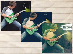
1. Go ahead and open your picture. Today I'll be using a pic of my favoritest guitarist JB Brubaker from my favoritest band August Burns Red =]

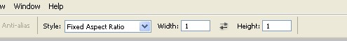
2. If your picture isn't already cropped, go ahead and crop it to that same boring icon size of 100x100. A really frackin easy way to do that is to use the Rectangular Marquee Tool (duh) but set the Style to "Fixed Aspect Ratio" and make the width and height 1. Like this:
So crop it already, dangit! This is mine:

3. Now make sure that while you're doing this tutorial you are listening to music.It's not obligatory actually, yes, it is, and it makes it more fun =]
4. Now we'll do some selective coloring by going to Layer>New Adjustment Layer>Selective Color (but don't be like me and accidentally click Channel Mixer and then get all confused because it looks different) and hit Enter. Use the following settings. (But feel free to tweak them how you like to make your picture look better. Example: Reds are too red, tone it down by all means!)
REDS:
Cyan: -40
Magenta: 0
Yellow: +100
Black: -30
YELLOWS:
Cyan: -100
Magenta: +14
Yellow: +100
Black: -30
CYANS:
Cyan: +100
WHITES:
Cyan: +40
Magenta: -50
Yellow: +30
Black: -100
NEUTRALS:
Cyan: +37
Magenta: +25
Yellow: +41
Black: -10
BLACKS:
Black: +100
And here's my outcome:

On some pictures it won't make a huge change (that's Photoshop, my friends!) but this part will.
5. Now you're going to make a 'New Fill/Adjustment Layer' which you'll find on the Layers palette, and click 'Solid color,' and fill it with #12375e. Set that layer to Exclusion. If your picture doesn't have a lot of black in it, I'd set it the opacity to around 80%, but if it has a lot of black or white make it a little lower (or whatever looks best to you). Mine has a lot of black so I'm setting it to 65%.
Hope that helped, saradiane!
Here's my outcome.

6. Now time for some textures! I'm going to use a couple (from Hybrid Genesis), so get ready.
I'm gonna be using these:

7. Paste the first one on your picture and drag it wherever it looks good. I set mine to Hard Light at 45%, and erased his Ibanez a little to make it stand out:

8. Paste the second texture on your picture. I'm using this one to make it a little more red, less blue. I set mine to Linear Burn at 50%, flattened the image, duplicated the base and set it to screen at 50%:

Ta-da!
9. You can flatten your image and stop here, or keep going. But if you keep going I'm gonna add a brush and text so get ready!
10. Flatten your image, and copy this image and paste it on your icon where it looks okay.

11. Set it to Screen.
11. DO NOT FLATTEN YOUR IMAGE YET. Put text on top of the brush. I chose Georgia.
12. Take the Magic Wand Tool and (while having the text layer still selected) click on your picture. Go to Select>Inverse.
13. Click on the brush layer and press Delete. Then get rid of the text layer. Flatten.

Sharpen if necessary, and you're done =]
Hope ya had fun.
Here's another example:

It makes good nature pics too:

Tweak it all you want and you can use it for anything.
XOXO The Cheat =]
1. Go ahead and open your picture. Today I'll be using a pic of my favoritest guitarist JB Brubaker from my favoritest band August Burns Red =]
2. If your picture isn't already cropped, go ahead and crop it to that same boring icon size of 100x100. A really frackin easy way to do that is to use the Rectangular Marquee Tool (duh) but set the Style to "Fixed Aspect Ratio" and make the width and height 1. Like this:
So crop it already, dangit! This is mine:
3. Now make sure that while you're doing this tutorial you are listening to music.
4. Now we'll do some selective coloring by going to Layer>New Adjustment Layer>Selective Color (but don't be like me and accidentally click Channel Mixer and then get all confused because it looks different) and hit Enter. Use the following settings. (But feel free to tweak them how you like to make your picture look better. Example: Reds are too red, tone it down by all means!)
REDS:
Cyan: -40
Magenta: 0
Yellow: +100
Black: -30
YELLOWS:
Cyan: -100
Magenta: +14
Yellow: +100
Black: -30
CYANS:
Cyan: +100
WHITES:
Cyan: +40
Magenta: -50
Yellow: +30
Black: -100
NEUTRALS:
Cyan: +37
Magenta: +25
Yellow: +41
Black: -10
BLACKS:
Black: +100
And here's my outcome:
On some pictures it won't make a huge change (that's Photoshop, my friends!) but this part will.
5. Now you're going to make a 'New Fill/Adjustment Layer' which you'll find on the Layers palette, and click 'Solid color,' and fill it with #12375e. Set that layer to Exclusion. If your picture doesn't have a lot of black in it, I'd set it the opacity to around 80%, but if it has a lot of black or white make it a little lower (or whatever looks best to you). Mine has a lot of black so I'm setting it to 65%.
Hope that helped, saradiane!
Here's my outcome.
6. Now time for some textures! I'm going to use a couple (from Hybrid Genesis), so get ready.
I'm gonna be using these:
7. Paste the first one on your picture and drag it wherever it looks good. I set mine to Hard Light at 45%, and erased his Ibanez a little to make it stand out:
8. Paste the second texture on your picture. I'm using this one to make it a little more red, less blue. I set mine to Linear Burn at 50%, flattened the image, duplicated the base and set it to screen at 50%:
Ta-da!
9. You can flatten your image and stop here, or keep going. But if you keep going I'm gonna add a brush and text so get ready!
10. Flatten your image, and copy this image and paste it on your icon where it looks okay.
11. Set it to Screen.
11. DO NOT FLATTEN YOUR IMAGE YET. Put text on top of the brush. I chose Georgia.
12. Take the Magic Wand Tool and (while having the text layer still selected) click on your picture. Go to Select>Inverse.
13. Click on the brush layer and press Delete. Then get rid of the text layer. Flatten.
Sharpen if necessary, and you're done =]
Hope ya had fun.
Here's another example:
It makes good nature pics too:
Tweak it all you want and you can use it for anything.
XOXO The Cheat =]
Tutorial Comments
Showing latest 10 of 19 comments

I freaking LOVED this.
By schlampe on Jul 6, 2009 12:12 pm

man thanks this is soo cool! i always wanted to know how to make cool icons^^
By medli96 on Jun 30, 2009 3:22 am
cools
By forgetit on Jun 12, 2009 6:52 pm

oh~ thank u so much for posting this!! ^^
By xchangminniex on Jun 10, 2009 2:31 pm
that does make hackin awesome icons haha ^^ anyway the outcome looks amazing! i can't wait to try it out!
By xchangminniex on Jun 10, 2009 2:30 pm

One of the best tut's of icon-making
ive seen, thanks mucho!!♥
By JayJayBabyy on May 28, 2009 2:11 am

i loved this tut, i did my first icon thanks to it! ^^
By Mausitax on May 8, 2009 7:34 pm

thanx for da tutorial!! i really appreciate dis!! hu2...
By falconcyborg on May 8, 2009 10:22 am

I've never thought about trying to make icons before, but I just learned a lot of cool things by going through this tutorial and trying it out. Thanks. You did a great job. It was easy to follow! :)
By dotaquote on Apr 24, 2009 4:26 pm

nice (:
By futura on Apr 12, 2009 8:02 am