Tutorial
Click on thumbnailed images to enlarge
Iconesque Part 6
Iconeque Part 6
Note: The following was created in PS CS4. No guarantees on its ability to be translated.
1. Obtain your base, as is usual at this step.
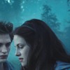
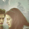
Yes, it is indeed a Twilight base. I liked the blueness in the movie, but it makes iconing seriously hard.
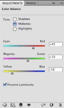
2. Create a new Color Balance layer, and use the following settings:
3. Create a new layer, and fill it with #fff7ca. Set that layer to Soft Light.
4. Create a new Selective Coloring layer, and use the following settings:
Selective Coloring:
RED
-100 ; +100 ; -100 ; +100
YELLOW
0 ; 0 ; 24 ; 100
GREEN
-100 ; +100 ; -100
CYAN
-100 ; +100 ; +100
WHITE
-100 ; 0 ; 0 ; 0
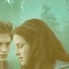
5. Duplicate your base, drag it up to the VERY top. Desaturate it. Set layer to Soft Light @ 30% Opacity.
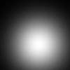
6. And for good measure, I took a SOFT edged brush, I believe the size was somewhere around 80, and just clicked once with the color white in the middle-ish of the icon. I then set that layer to SOFT LIGHT.
* Don't copy/paste that image. It will not work correctly on Soft Light
and voila! Totally got rid of that blueness. I think it's purty.
Iconeque Part 6
Note: The following was created in PS CS4. No guarantees on its ability to be translated.
1. Obtain your base, as is usual at this step.
Yes, it is indeed a Twilight base. I liked the blueness in the movie, but it makes iconing seriously hard.
2. Create a new Color Balance layer, and use the following settings:
3. Create a new layer, and fill it with #fff7ca. Set that layer to Soft Light.
4. Create a new Selective Coloring layer, and use the following settings:
Selective Coloring:
RED
-100 ; +100 ; -100 ; +100
YELLOW
0 ; 0 ; 24 ; 100
GREEN
-100 ; +100 ; -100
CYAN
-100 ; +100 ; +100
WHITE
-100 ; 0 ; 0 ; 0
5. Duplicate your base, drag it up to the VERY top. Desaturate it. Set layer to Soft Light @ 30% Opacity.
6. And for good measure, I took a SOFT edged brush, I believe the size was somewhere around 80, and just clicked once with the color white in the middle-ish of the icon. I then set that layer to SOFT LIGHT.
* Don't copy/paste that image. It will not work correctly on Soft Light
and voila! Totally got rid of that blueness. I think it's purty.
Tutorial Comments
Showing latest 5 of 5 comments

i love this
By foundry on Jan 25, 2009 1:19 am

oww! that's kewl.
i agreed too!
By -retired- on Jan 16, 2009 3:53 pm

neat. (:
By futura on Jan 12, 2009 8:22 am

haha i agree the blueness can be a problem:]
By lolili on Jan 9, 2009 8:13 pm

I really like the outcome. :)
By so-sarcastic on Jan 7, 2009 11:29 am
Tutorial Details
| Author |
technicolour
|
| Submitted on | Jan 6, 2009 |
| Page views | 7,648 |
| Favorites | 32 |
| Comments | 5 |
| Reviewer |
manny-the-dino
|
| Approved on | Jan 7, 2009 |