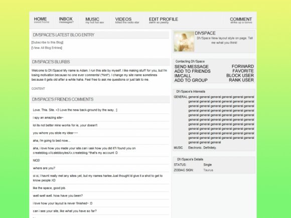
Designer's Comments
Look carefully for specific instructions
Browser Compatability:
Chrome - Made in and works best with Chrome. No problems.
Opera - Also works fine in Opera.
Firefox - For some reason everything is in bold...but it's fine.
Internet Explorer - Blog and blurbs headings don't go across. Table rollovers don't work. Bottom links not aligned. I would not recommend this if you use IE.
Put your friend ID where it says FRIENDIDHERE! There's only one place to put it, at the end of the About Me code.
Don't forget to check out my other layouts!
And add my Myspace
Using This Layout
For specific instructions read designer's comments
- 1. Log into myspace.com
- 2. Click on Edit Profile (Profile 1.0)
- 3. Copy (ctrl c) and paste (ctrl v) code to the specified fields
Layout Comments
Showing latest 10 of 10 comments

i might just be stupid but i cant figure out how to put my about me in this..

I like this. You should make one like this with black tables instead of white.

I loveee this layout. I really like the colors and the way its organized and set up. But is there a way to get the extended network to show? I tried, but either the display name/headline section disappears when the extended network shows, or the other way around lol.

i think its way cute, maybe you should try like scenic bg too, these are great tho :)

Very nice, but the black border that is around the entire top nav, doesn't go with it, and there is no rollovers. I like rollovers. But I still like the theme. I like the concept you're going for. But I still think it's due for a re-do. No offense in tended. Just stating what I think about it.

Woah, very niiicee!!! It looks nice and sleek and the color scheme matches well with the simplicity of it. Great job!! :DD

this is PURE genius. i wish myspace was like this instead of 2.0.

This is definitely awesome..

WOW! If myspace was like this i would've kept my myspace.

This is my favorite out of the color schemes!
Layout Details
| Designer |
divspace
|
| Submitted on | Jul 28, 2009 |
| Page views | 15,303 |
| Favorites | 52 |
| Comments | 10 |
| Reviewer |
A1Bassline
|
| Approved on | Jul 28, 2009 |