HP6 (comments)
Displaying 1 - 18 of 18 comments


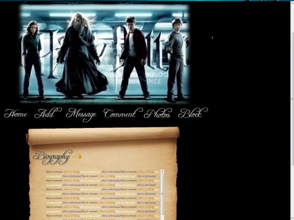
I like the idea for the scroll paper, this is looks pretty good :)

I think the scroll bar is a great idea for Happy Potter but kind of reminds me of 'aQuafly' layout for Alice In Wonder layout~

the scroll is pretty neat but im not a huge fan of the font used for the links and i think more could have been done to the banner... but for it only being your 2nd acceptence i think its good :)

i really love this ;D
since i'm currently obsessed with HP ! XD

It's cool, but I think the banner image is too modern for the scroll paper. I love the scroll part though, it's a really neat concept(:

thank you karisa :] and everyone else who likes this ^_^ . Thanks for the advise elle :] will do next time.


looks pretty good (: try using a simpler font for the links next time (;

This is by far the best HP layout I have seen. It is perfect. FANTASTIC JOB!

Looks great, love the image of the scroll on the bottom.. :]
@ schizo, yeah i did but it got rejected too :[ so i thought, screw it, i'm just going to try another one hahaha.

It looks pretty good but I don't really like the banner image, I think more could have been done. :|

Wow, this one is so much better than your other one...did you ever edit that one or no?

I'm not a fan of the layout itself but.. I take it you cut them out of their hideous backgrounds? If so you did an awesome! job [=
Add Comment
You must be logged in to comment
Layout Details
| Designer |
StormyBlue
|
| Submitted on | Jul 25, 2009 |
| Page views | 8337 |
| Favorites | 51 |
| Comments | 18 |
| Reviewer |
schizo
|
| Approved on | Jul 25, 2009 |