Designer's Comments
Look carefully for specific instructions
CREDIT
Textures
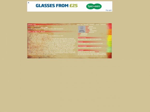
This layout is one in an on-going set on our website. So far there are 4 but there are a lot more in the works. Visit LASTSUNRISE.NET for more versions of this layout.
The colour schemes for these layouts come from album covers in my collection, just ones that happen to have a pretty colour scheme.
This one is taken from the gorgeous cover of You Me At Six's album, Take Off Your Colours. Yummy Yummy Yummy cover(:
Oh yes, and check out those teeny-tiny rollovers. Whatapaintocode >:[
LIKE THIS?
WEBSITE | MYSPACE
Textures
This layout is one in an on-going set on our website. So far there are 4 but there are a lot more in the works. Visit LASTSUNRISE.NET for more versions of this layout.
The colour schemes for these layouts come from album covers in my collection, just ones that happen to have a pretty colour scheme.
This one is taken from the gorgeous cover of You Me At Six's album, Take Off Your Colours. Yummy Yummy Yummy cover(:
Oh yes, and check out those teeny-tiny rollovers. Whatapaintocode >:[
LIKE THIS?
WEBSITE | MYSPACE
Using This Layout
For specific instructions read designer's comments
- This is a div overlay layout, html knowledge required!
- 1. Log into myspace.com
- 2. Click on Edit Profile (Profile 1.0)
- 3. Copy (ctrl c) and paste (ctrl v) code to the specified fields
Layout Comments
Showing latest 10 of 14 comments

This is really minimalist with some real color at the same time, and I like it!
By Butterface89 on Sep 4, 2010 12:14 am

i hate simple layouts
but this one is gorgeous
font bigger though
By emmijane on Mar 6, 2010 6:58 am

you me at six in auhmazing =D
By codydarlingx on Jul 27, 2009 11:54 pm

Very interesting. I like this. :) Good work! ~ZeroGrafics
By ZeroGrafics on Jul 19, 2009 2:00 pm

I agree with the background needing a bit more "popping" but still, love it.
By futura on Jul 17, 2009 8:59 pm

Very nice. I love the headers!
By CandyPop on Jul 17, 2009 4:03 pm

I love the colors. For some reason the previewer has black text, but in the image preview you provided the text is white. The black text is hard to read.
By emberfly on Jul 17, 2009 2:36 pm

i love this layout !! quteee !! *.* :)
By luvzzyahzz on Jul 17, 2009 12:26 pm

ooh, very pretty ^^
By lostinLDN on Jul 17, 2009 10:12 am

Pretty :3..
GOOD JOB!
By Snaily on Jul 17, 2009 10:07 am