restless Heart Syndrome (comments)
Displaying 1 - 13 of 13 comments

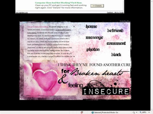
What makes me love this is that Impact Labeler font used for the word 'Insecure'. That makes the layout. That's my favorite font. So much fun.It looks so clear in your layout...unusually clear. But....I keep repeating myself with every post and nobody's talking about how they get that 'effect'. The rollovers in this are wonderful. The pink and black look good together in here and the rollovers are divine in this. This is an A level layout for me.

the wording at the bottom should be closer.
still gorgeous though.
the font for Broken Heart doesnt seem right

I need help Im a beginner in making layouts. I have this idea for a div overlay layout and I don't even know where to begin


i love the gradient to this and the colors wat i wish was different is the white square wasn't just stuck in the middle around the black background like that. if maybe the white part had a little border or something to finish off then i think it would really just make things pop. you know how i am im not trying to "dis" your layouts cuz your amazing like everyone else is and i just wish i can make something like this. plus for some damn reason i always got something to say. ha. good or bad.


gorgeous. I wish the rollover color was a bit different. Amazing girl layout! haha ;)

Add Comment
You must be logged in to comment