Designer's Comments
Look carefully for specific instructions
Notes:
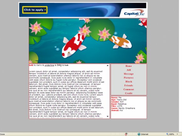
Dude.. ok so this is the first time i used the pen tool in a while, and i gotta say.. i'm pretty proud tbh. Inspiration came from a Koi tattoo I designed a couple of months back, only this is nicer :P
I really like it and i hope someone else will do to (:
NOTE: This layout will look best in IE, it will work in other browsers, but some of the text colours may be lost.
Use:
please leave the credit on, and for the links just replace the X's with your friend ID.
Credit:
Everthing on this layout was made by Lastsunriselayouts
Other:
Constuctive criticism/comments, and general feedback will be very much appreciated because of the long layout gap (:
thankyou for viewing!
~Martz
x---x
*also, the Nav-bar shadow does not show on myspace.
Using This Layout
For specific instructions read designer's comments
- This is a div overlay layout, html knowledge required!
- 1. Log into myspace.com
- 2. Click on Edit Profile (Profile 1.0)
- 3. Copy (ctrl c) and paste (ctrl v) code to the specified fields
Layout Comments
Showing latest 7 of 7 comments

love this! it's perfect for a good summery feel too...i'm gonna use it ;D
By unabanoona on Jun 22, 2009 5:55 pm

very cute! love the navi!
By mystiicdesigns on Jun 20, 2009 1:28 pm

i love the header image, its amazing, haha.
but i think you should move the about me to the right a couple pixels along with
the navigation. &make the navigation like one row each would look nicer, imo.
like this
home
add
etc.
but i like it either way [:
By nikx618 on Jun 20, 2009 3:46 am

;D love it!
By xXcalebboylesXx on Jun 19, 2009 9:40 am

This is awesome! I going to use this!
By CandyPop on Jun 19, 2009 7:39 am

you, woman, are actually amazing. this is awesome.
By aliiicimo on Jun 19, 2009 6:37 am

looks pretty good. I like it. :)
By Mikeplyts on Jun 19, 2009 4:21 am
Layout Details
| Designer |
SammyTheHeadbutt
|
| Submitted on | Jun 18, 2009 |
| Page views | 8,563 |
| Favorites | 55 |
| Comments | 7 |
| Reviewer |
manny-the-dino
|
| Approved on | Jun 19, 2009 |