bio (comments)
Displaying 1 - 20 of 20 comments

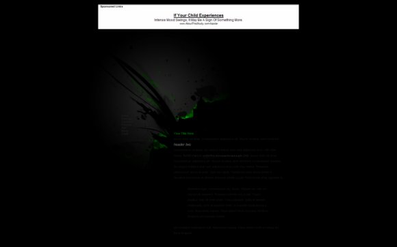
This is called "Bio" and it seems like it's been inspired by a video game. It's kinda sweet.

gah more contrast! change text color! and chnage text font size

Must agree.. the font is unreadable.
I love what is visible, though.

Really cool, but it all shows up super dark on my screen... maybe it's just my computer, though.


Nice. The font is really dark, but I kinda like it. I'm not a big about me person, so I think it's better that not so much attention is put on it. :D


I'm forced to agree with the others, the font does need to be slightly lighter. Just for general use =/
It's a brilliant layout all together though. Brillopad!

nice. it reminds me a bit of resident evil for some odd reason lol but the font needs to be lighter fyi

Nice!! I like it, Alek! It's a bit too dark, imo. But w/e. Great job! :D

That is friggin' bad a.
the only thing i don't like is maybe you could make the font lighter, maybe a dark grey

The Image Is Kick-Butt!!!
Like the colors!!!Good Job!Keep Up The Great Work.


As always the Image NEVER shows!
D:
From the Preview Its looks nice.
The Green and black goes great together.

i love the graphic, but it doesn't show up in live preview /= nice job though (:
Add Comment
You must be logged in to comment