Dark Flowers (comments)
Displaying 1 - 20 of 22 comments

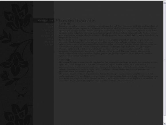
i actually think the navigation fonts could be lighter and the rest should be darker. i think they'd stand out more that way. i find myself straining to read the text. not a good thing.


It's a great layout but like everybody else said the font is way too dark, sorry. =X


the only thing i don't like about this layout is the font color
it's hard to read
but i like the structure

The only thing I dislike is the font style and color. I'd rather have it white, but that's just me. You did a great job.

i really like this...
its weirdly amazing :L:P
not the normal layout id go for...
but this one works really well!!
xx

I really like how yo put the ad on the bottom. I'm happy that the alignment is actually right! The only thing is the font color, I wish it could be a tad lighter.


I agree with everyone else,
awesome layout but the font is just too dark.


i think the layout is great but the colors are waaaaay too dark. can hardly ready the font.. :/

It's pretty but that font is impossible to read even with my glasses on.

I like this :D
Any way you could make this in a turquoise, and different shades of blues?

I really like the simplicity of this. The setup is great but yeah, the font size is really the only thing that bugs me. Otherwise, great job! :)

the alignment is actually fine on myspace, it's messed up in the preview only. and the content box isn't cut off, the scroll bar is covered up. hover your mouse over it and use your wheel. ;]

The font is pretty small, but I totally love the concept!! If you make the font a bit bigger and fix the alignment issues, it would be perfect!

Cute. Only 2 minor issues. The header for your name overlaps the about me header and the main content are is cut off at the bottom. Other than that, very cute ^-^
Add Comment
You must be logged in to comment
Layout Details
| Designer |
Smarmosaur
|
| Submitted on | May 2, 2009 |
| Page views | 17943 |
| Favorites | 95 |
| Comments | 22 |
| Reviewer |
schizo
|
| Approved on | May 2, 2009 |