Designer's Comments
Look carefully for specific instructions
Note: The ad is not hidden, it's just simply moved to the bottom, well out of the way. ;]
Of course, no credit removal or spuds attack in your sleep.
Using This Layout
For specific instructions read designer's comments
- This is a div overlay layout, html knowledge required!
- 1. Log into myspace.com
- 2. Click on Edit Profile (Profile 1.0)
- 3. Copy (ctrl c) and paste (ctrl v) code to the specified fields
Layout Comments
Showing latest 10 of 22 comments

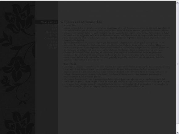
i actually think the navigation fonts could be lighter and the rest should be darker. i think they'd stand out more that way. i find myself straining to read the text. not a good thing.
It's a bit difficult to read the main text.
Very pretty, but a bit too dark for my liking :)
It's a great layout but like everybody else said the font is way too dark, sorry. =X
a little hard to read the text, but overall nice layout (:
the only thing i don't like about this layout is the font color
it's hard to read
but i like the structure
The only thing I dislike is the font style and color. I'd rather have it white, but that's just me. You did a great job.
i really like this...
its weirdly amazing :L:P
not the normal layout id go for...
but this one works really well!!
xx
I really like how yo put the ad on the bottom. I'm happy that the alignment is actually right! The only thing is the font color, I wish it could be a tad lighter.
very lovely ;)
Layout Details
| Designer |
Smarmosaur
|
| Submitted on | May 2, 2009 |
| Page views | 17,942 |
| Favorites | 95 |
| Comments | 22 |
| Reviewer |
schizo
|
| Approved on | May 2, 2009 |


