Prehrana (comments)
Displaying 1 - 16 of 16 comments


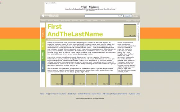
I really like this layout, but I'm not so down with the colors. Is there another layout just like this but with different colors?

I love rainbows. Even though this is about half the rainbow, it's still nice.

I've looked through the coding and I can't find where I'm supposed to switch out the link for the image where the 100x100 box is now. Am I just missing it in the code or is it just not there?

I think if you used simple colours like black and white it would be awesome. Still, I like it.


Yeah, I think it would be better with out the drop shadow. The rollover are awesome.

Other than the shadow thing, I think it's really nice. The rollovers are interesting.

I really really like dis. Could u make one with more "guyish" colors? The rainbow thing kinda sends a message that doesn't reflect me lol

I like it, the colors are awesome. I can maybe see the idea you were going for when you didn't use the shadow at the top and bottom, but it might've been better to keep going with the gradient. In my browser, there are some characters showing up that shouldn't be there, mainly one of these: Â. I don't know why it's there, but it makes scrollbars in the friends area, and there's one in the header for last and first name as well. Could be my browser, or resolution, I'm on a widescreen laptop, but my resolution is pretty high.

I agree with elletricity. I like the setup and all but maybe you should make it kind of fade off where it cuts off. Good job though. :)

I like the colours and the links/rollovers, but the shadow gradient thing looks weird cut off near the top, and the bottom looks completely cut off. It may be just me though.

Add Comment
You must be logged in to comment
Layout Details
| Designer |
Medi
|
| Submitted on | Apr 10, 2009 |
| Page views | 17185 |
| Favorites | 128 |
| Comments | 16 |
| Reviewer |
manny-the-dino
|
| Approved on | Apr 11, 2009 |