Edward Cullen (comments)
Displaying 21 - 24 of 24 comments

You get a Bonus,since you used some of the shades/colors I Love!!!xD
I Like It!!!haha he popped in My Head Now :O!
Lolz,Good Job!Keep Up The Great Work!

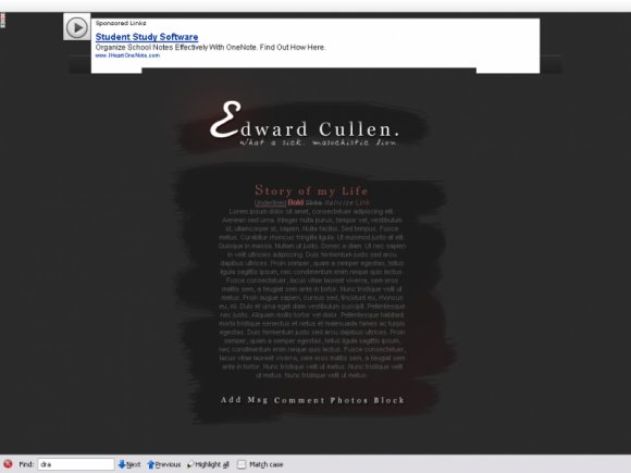
I like the glowing E, and the gradients that you used there, and at the bottom right of the layout. it adds more depth to the layout overall. It is a little on the simple side though, you used one brush to erase the part of the background that you wanted to make, and you have one div set there for the main text of the layout. Maybe you could spruce it up a bit if you added a type of effect to the navigation, that will go with the rest of the gradient look of the layout.

i don't quite like the shadows on the link hovers. i love everything else though (: it's so simple and elegant-looking.
Add Comment
You must be logged in to comment
Layout Details
| Designer |
none345678
|
| Submitted on | Apr 5, 2009 |
| Page views | 23619 |
| Favorites | 115 |
| Comments | 24 |
| Reviewer |
A1Bassline
|
| Approved on | Apr 5, 2009 |