Designer's Comments
Look carefully for specific instructions
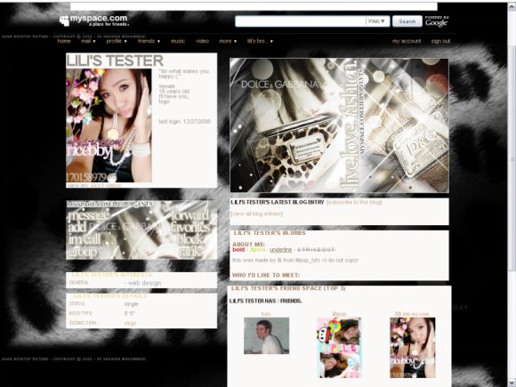
different style for lilipop_lyts..
comment & favorites please!
another preview on my tester page: http://i110.photobucket.com/albums/n93/lilipop_lyts/lyt/37pv.png
for more great layouts.. add... www.myspace.com/lilipop_lyts
comment & favorites please!
another preview on my tester page: http://i110.photobucket.com/albums/n93/lilipop_lyts/lyt/37pv.png
for more great layouts.. add... www.myspace.com/lilipop_lyts
Using This Layout
For specific instructions read designer's comments
- 1. Log into myspace.com
- 2. Click on Edit Profile (Profile 1.0)
- 3. Copy (ctrl c) and paste (ctrl v) code to the specified fields
Layout Comments
Showing latest 10 of 12 comments

is there anyway, you could make this a myspace 2.0 layout?
By fiddlestix on May 13, 2009 2:37 pm

yeah the credit does ruin it. but i think the layout is really cool either way. good job [:
By itsmegandarling on Jan 9, 2009 12:27 pm

Love D&G.
By TheExoticPeachFairy on Jan 2, 2009 11:37 am
love it I'm using it on myspace
By fiddlestix on Jan 1, 2009 7:26 pm

i agree. the credits are too big and takes away from the banner.
By ae221 on Dec 29, 2008 4:04 pm

you could tone down your credit a lot, it takes away fro the layout.
Cute though
By none345678 on Dec 29, 2008 3:38 pm

I like the banner & contact table but I think the credit kills it, for me atleast :P
By imperfectionistx on Dec 29, 2008 1:36 pm

cute not bad
By LadyLBlack on Dec 29, 2008 11:00 am

i think the background kills it.
By futura on Dec 29, 2008 2:19 am

OMG....COOL!!!!Good Job!Keep Up The Great Work!!!!
By Snaily on Dec 29, 2008 1:02 am
Layout Details
| Designer |
lilipoplyts
|
| Submitted on | Dec 27, 2008 |
| Page views | 35,076 |
| Favorites | 117 |
| Comments | 12 |
| Reviewer |
manny-the-dino
|
| Approved on | Dec 28, 2008 |