afraid of losing you. (animated) (comments)
Displaying 1 - 20 of 64 comments


this is georgous! I'd love to see something like it for harry potter or chronicles of narnia.


i used this layout.but i got funny white box in the middle.idk how to take it off.help?

hmm i used the layout, but it got all funny, i can see one of my boxes underneath the layout. here is my myspace link.
http://profile.myspac e.com/index.cfm?fuseaction=use r.viewProfile&friendID=9586664 2
How do i fix it?


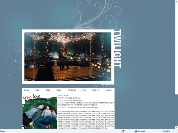
the construction and thought that went into this layout is pretty flippin sweet.
i'm kind of sick of twilight now, but this layout....is awesome.

This is very nice.
I love Blue Foundation too :D
haha good job ")

To Suddenly - Rollover images aren't everything. I balanced the busy banner with simple links to give a clean, minimal look.


the only thing I don't like about this is the navigation. It's just links, no rollover images. But other than that, it's very nice, and very clean.
To unforgetablelove: You most likely accidentally deleted or added something that has messed up the code. Try copying and pasting this code again and editing it to your tastes.
I had a scrollbox on my page and now the tezt in the box isn't showing up....is there anythin I can do about that?

nice lyt, and the animation that's like a cherry on top,
but i would of suggested flash for the animation, cuz it's a little slow
EdWARdPsWiFfEY - You forgot to copy/paste the Heroes Code. Do that and the white space will be gone.
Add Comment
You must be logged in to comment
Layout Details
| Designer |
digitalfragrance
|
| Submitted on | Dec 17, 2008 |
| Page views | 36061 |
| Favorites | 327 |
| Comments | 64 |
| Reviewer |
manny-the-dino
|
| Approved on | Dec 17, 2008 |