Decode ft. Hayley Williams (comments)
Displaying 1 - 11 of 11 comments


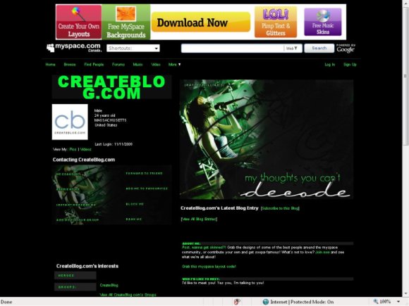
the reason the text is black is because it goes along with the theme of "my thoughts you can't decode". people can't "decode" what you type on your page unless they highlight it with their mouse lol.
i think it's pretty clever :D
great job!

i cant read the writing. why is the text black? couldnt you make it white or a shade of green so we can actually read it?


Don't bother agreeing with blaqheartedstar.
I'm not changing it. The plain layout generally looks better and having coloured tables is pointless as it would just make it look really cramped up.

i love it but i wish i could see my text. and i also agree with blaqhearted star


really like the extended network banner, but try adding some background color to the tables. Looks pretty plain.
Add Comment
You must be logged in to comment
Layout Details
| Designer |
Decode
|
| Submitted on | Dec 14, 2008 |
| Page views | 12255 |
| Favorites | 63 |
| Comments | 11 |
| Reviewer |
manny-the-dino
|
| Approved on | Dec 15, 2008 |