Designer's Comments
Look carefully for specific instructions
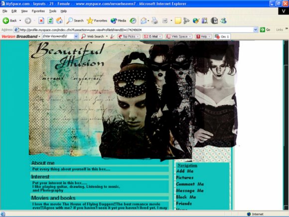
Remember to put your friend ID in the X's
Dont take the credit off or claim it as your own please.
works in both ie and ff
I'm not quite sure how the color will look for you cause it looks different between my 2 computers.
Credits
http://herfamedgoodlooks.com/
http://sanami276.deviantart.com/
http://puzzle.digital-distortia.com/
http://brushes.500ml.org/
http://amaya-stock.deviantart.com/
http://www.hybrid-genesis.com/index.html
Thanks to Anarchy who helped me out with a problem about my codes!
Better version of this layout go to http://thepapermoon.tripod.com/layouts.html
Though the ad is blocked on it. But I personally like it alot better. Alot.
Using This Layout
For specific instructions read designer's comments
- This is a div overlay layout, html knowledge required!
- 1. Log into myspace.com
- 2. Click on Edit Profile (Profile 1.0)
- 3. Copy (ctrl c) and paste (ctrl v) code to the specified fields
Layout Comments
Showing latest 6 of 6 comments

this is so beautiful.
By nolarosebud on Dec 22, 2008 2:41 pm

Thank you guys!:)
By ironicsilence on Dec 1, 2008 11:04 am

I love this. I agree with xzkdzrawrx about the blending, but other than that, it's pretty much amazing. I'm deffinately using it. :D
By DelilahDisaster on Nov 29, 2008 1:38 pm

i relaly love the concept except i think the font for the controls is idk and i think more effort coulda been into it but its really nice tho
By Jenni on Nov 29, 2008 12:12 pm

this is sick.. iLove it =D
By byebyelove on Nov 29, 2008 2:33 am

It looks good ^.^
The only thing that sticks out for me is that the banner just has these straight lines against the background (the edges of the banner). It wouldve looked a little nicer if there was some blending with the background ^.^
Other than that, its awesome :3
By Firiath on Nov 28, 2008 11:14 pm
Layout Details
| Designer |
ironicsilence
|
| Submitted on | Nov 28, 2008 |
| Page views | 8,928 |
| Favorites | 68 |
| Comments | 6 |
| Reviewer |
schizo
|
| Approved on | Nov 28, 2008 |