Designer's Comments
Look carefully for specific instructions
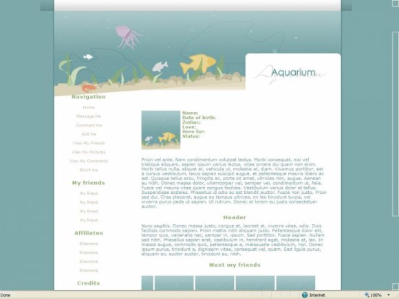
This is the third of my Apothesis.net series.
I would like to say thank you to Zong for giving me the rights to use her banners.
Warm thanks to xxlilxkevxx for letting me use and study his stylesheet.
Works better in IE.
There is a pixel misalignment in FF. You can fix it. Like this:
.image{
position: absolute;
left: 50%;
margin-left: -474px;
top: 70px;
z-index: 0;
Using This Layout
For specific instructions read designer's comments
- This is a div overlay layout, html knowledge required!
- 1. Log into myspace.com
- 2. Click on Edit Profile (Profile 1.0)
- 3. Copy (ctrl c) and paste (ctrl v) code to the specified fields
Layout Comments
Showing latest 6 of 6 comments

awh, this is really cute. The alignment is only like 2 pixels off, I swear. Grr.
By shadowkissed on Nov 29, 2008 1:18 am

Nice!! :D Yep, as itsmattadams said, the tables are very slightly misaligned in FF.
By dreamgurl36 on Nov 28, 2008 8:06 pm

Adorable! =)
By emmasawr on Nov 28, 2008 4:32 pm

Amazing layout =)
For some reason in Opera it won't let you scroll down =(
By dilligrout on Nov 28, 2008 8:44 am

I like the banner. Slight alignment issue in Firefox due to being made in IE.
By itsmattadams on Nov 28, 2008 6:53 am

Cute! I like the banner.
By tokyo-rose on Nov 28, 2008 6:23 am