Designer's Comments
Look carefully for specific instructions
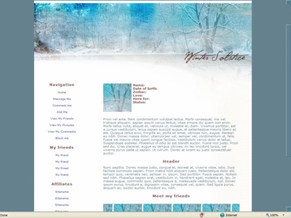
This is the second of my Apothesis.net series.
I would like to say thank you to Zong for giving me the rights to use her banners.
Warm thanks to xxlilxkevxx for letting me use and study his stylesheet.
Works better in IE.
There is a pixel misalignment in FF. You can fix it. Like this:
.image{
position: absolute;
left: 50%;
margin-left: -474px;
top: 70px;
z-index: 0;
Using This Layout
For specific instructions read designer's comments
- This is a div overlay layout, html knowledge required!
- 1. Log into myspace.com
- 2. Click on Edit Profile (Profile 1.0)
- 3. Copy (ctrl c) and paste (ctrl v) code to the specified fields
Layout Comments
Showing latest 7 of 7 comments

Thank you for the comments. Yes, ater the layout, whatever you like. Enjoy it!
By Katinka on Dec 26, 2008 1:28 pm

i heart this layout but i have actualli removed the second section cuz i had nothing to write and moved the marquee a little bit higher. :)
I'm a perfectionist. :)
By lostinside1 on Dec 24, 2008 12:53 pm

gorgeous. :)
By shadowkissed on Nov 28, 2008 8:18 pm

great work! :)
By diputs on Nov 28, 2008 5:51 pm

Heh, this is really pretty. Though, I agree with jaeminnie.
By Naekipz on Nov 28, 2008 3:21 pm

Pretty :)
By Brighter on Nov 28, 2008 4:45 am
Lovely banner, but the left-side module seems a bit plain.
By tokyo-rose on Nov 28, 2008 1:22 am