1982 (comments)
Displaying 1 - 15 of 15 comments


ok umm why is it that wen pple try to go into the piks or bak home or comment it says the account mustve been deleted or what not! why is that? can someone help me out to get them links to go to my stuff. im kinda not good wit that stuff. id appreciate it... thnx

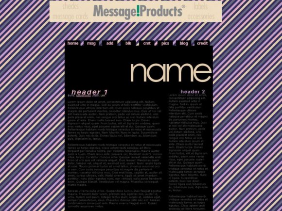
yes, i really do like how clean and orderly this is... um, i know that you asked us not to tweak it, but i was wondering if i could put a picture next to the 'name' part... could you please tell me how to do that (or perhaps give me a code)? ...but i totally respect your opinion if you wish not to :)

I LOVE IT BUT CHECK IT AGAIN THERE'S AN ERROR IN THE CODE BEACUSE IT DOESNT WORK PERFECTLY... =[

This is realllllyyyyyy simple, the font choice is poor, and it's misaligned in firefox. If I were you I would try to spice it up a bit with some kind of image and chose a font that is more complimenting to the layout.


it's misaligned, but it could just be the preview.
i still like it. :)

i like this.
but it wouldv'e looked better with the top name to be a straight line.
not jagged.
BUT IT'S STILL AWESOME!

I think it's incredible how i can simply see the top of the layout and know it's by you. Haha.
I love this layout. It looks amazing. Very good job :]

i love the color scheme but somehow i don't quite like the rollovers


very nice and clean but the text is very dark and difficult to read. Would have been super cute if the text were purple. Nice work overall.
Add Comment
You must be logged in to comment
Layout Details
| Designer |
melancholiclights
|
| Submitted on | Oct 31, 2008 |
| Page views | 39120 |
| Favorites | 318 |
| Comments | 15 |
| Reviewer |
jaeminnie
|
| Approved on | Nov 1, 2008 |