Breakfast at Tiffany's (comments)
Displaying 1 - 17 of 17 comments


loveee the layout but i have NO IDEA how to put pictures in the scrolly part.
little help would be GREATLY appreciated.
thx.

aww FINALLY someone did an audrey layout!! i love it!!!!!!!


Cute layout. I think it's a little bit too busy though, other then that it's really cute

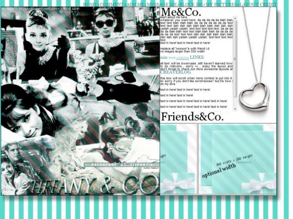
Very nice layout. I like how you made the pictures for friends bigger than just 100 by 100. I also like that you still have rollovers for the navigation. [=
I do see how it's misaligned at the top and bottom of the images, but oh well. Overall, I still think it's a pretty nice layout.

yeah something is wrong with the stripes i tried literally 6 times & 6 diff ways to get the background to align and it didnt work

absolutly love it....so mad i just changed my profile last night....this is def my next one!!!!!

i'm using firefox, and the stripes seem a bit misaligned in the top left corner of the page, next to the banner ad. other than that, i love it (=

Although I think Breakfast at Tiffany's is overrated.
I like this layout, the colors are pretty :]

wow i was just yesterday thinkn bout makin an Audrey Hepburn Layout .. :)

I think the layout is nice and that people need to stfu sometimes.
gee what an insult "it looks rushed"
yes it's no secret that the quality isn't the greatest, but i had a difficult time finding pictures from around the 60's or whatever in perfect quality like you can find today.
&& also im sorry you feel that way about the pattern i layered over the design but i like it that way, and of course, well, this is my design and not yours.
not trying to offend you.
oh & p.s. its blue not green.
&the navigation's simplicity doesn't over do the layout.


First of all i like the idea here
I like the big images for your friends
I dont like the green lines in the image much
Also the navigation could have been alot better
Overall a fairly good layout seems rushed though

Add Comment
You must be logged in to comment