iPod: The Next Generation (comments)
Displaying 21 - 27 of 27 comments


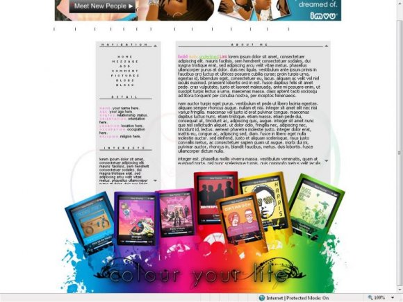
I personally don't like the text in the bottom banner, but the banner itself is awesome. :D
Posted by dreamgurl36 on Oct 11, 08 7:47 am

would have been cool to make the nav hover links match the colors of the ipods below... since you have 7 links in your nav and 7 ipods. :) still a very cool idea! love the vibrant colors at the bottom!
Posted by ingodwerust on Oct 11, 08 2:39 am

awww no james blunt... lol
pretty awesome layout. love the simplicity of the layout with the footer.
Posted by Blaqheartedstar on Oct 10, 08 10:57 pm

I actually like that the banner's at the bottom.
The colors are amazing also. 8D
Posted by so-sarcastic on Oct 10, 08 9:41 pm

very nice, I just wish the banner was at the top. But it's a good layout nonetheless. :)
Posted by aQuafly on Oct 10, 08 9:27 pm

« Prev ·
Page 2 of 2
Add Comment
You must be logged in to comment