Grungy lyrics (comments)
Displaying 1 - 20 of 24 comments


this is soo my myspace!i hate that friendid bull but i got it working now:PP

i like it,
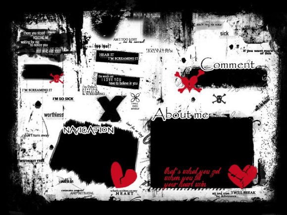
except i think the about me box is a little too small.
otherwise, i loveeeeit. {:

Ooops, I forgot that.
But I went back and edited it and it now has a photo link.
:D


Love It... But it has no Photo Button.. So how do i get to the photos?


OMG YAY FLYLEAF QUOTES I LOOOOOOOOOOOOOOOOOOOOVVVVVVVVV VVEEEEEEE ITT!


I think it's a very good idea, but I also think that all the lyrics is abit much. Also, the brushes you've used for the hearts are abit blurry. I like where you've placed things though but I just think abit more brushes and abit less lyrics would be better.
My opinion anyway.
I really really like it though :)


i really like this
its the first div layout i've considered using in a long time
i especially like the paramore lyrics underneath the comment box
Thanks for the comments... And now that I look at it, the brushes do seem a bit messy, but this is a grunge layout. The object is to be messy, but not too messy. Anyways, I probably could have picked better fonts, but I liked the fonts when I made it so...
And I do agree that maybe the red stands out a bit too much.
I'm glad you like it :]

niot digging all the brushes used nor the two different fonts, but the lyrics bits are cool.
Add Comment
You must be logged in to comment
Layout Details
| Designer |
hikaribliss
|
| Submitted on | Sep 29, 2008 |
| Page views | 58827 |
| Favorites | 473 |
| Comments | 24 |
| Reviewer |
schizo
|
| Approved on | Sep 29, 2008 |