Paradise Lost (comments)
Displaying 1 - 17 of 17 comments


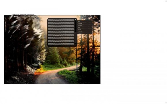
I adore this... I actually like the way the white background looks, though I agree it could be a bit smaller.

im actually reading the book Paradise Lost in my english class now. love the layout hate the book but maybe the box shood b a little bigger.


absolutely amazing. love the photo. although in my opinion the orginial would've been just fine but i get what you were trying to do. 'paradise lost'. although the smudging in black and white makes it look, at least to me, as though it's the change of seasons. going from fall to winter. i still love it either way. it's simple and beauty at its best. you should try to do more scenic type layouts, you've done a great job with this one. =]

i love it. The background is just too big. but otherwise it's gawjus

t's awesome but.....the white background is too big...O__o....haha XD

This one is really NICE! Love the image set as the background. Very unique.


All of ur layouts except for 1 have a white background...

its smudged because its called "paradise lost"
as in its getting LOST as in no more lol so i made it look on fire
but then in black and white
and i dont typically do scenic type layouts anyway

I don't like it.. why is the image smudged to hell in the top left? And the image is HUGE and theres nothing really there =(
Also the background is white =( should've taken a color out of the picture a green or red?

Wow. Just wow. :D This is exactly what I've been trying to find in a layout lately. Something beautiful, and not related to a show or anything. This is great. Simple about me box, as well as the nav, yet it goes great with the rest of the layout.

Add Comment
You must be logged in to comment
Layout Details
| Designer |
Theotherside
|
| Submitted on | Sep 26, 2008 |
| Page views | 34908 |
| Favorites | 317 |
| Comments | 17 |
| Reviewer |
schizo
|
| Approved on | Sep 28, 2008 |