Abingdon Boys School (comments)
Displaying 1 - 12 of 12 comments

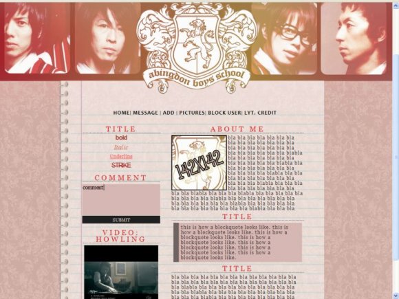
I like this a lot.. but don't really like the topbanner.
Very nicely done though!


Very nice style. It would be nice if the background continued on my screen, though. It just kind of ends. :/

Oh, and isn't "Abingdon" spelled with an "N"? I edited it for you.
I like the layout colors and simple, but not too simple navigation.


its aligned to me. Anyways i really like it. The colours are cool and everything matches which i like.

I agree w/ you Blaq. It does look misaligned on my screen. (mines is like a 50 in" lol) its pretty though.

background-position:center; < change that to left
people with large screen resolutions will see it as misaligned when its set to center.
also the header doesn't have to be soo long (takes a while to load). you can just crop it after the first line or until the background lines up.
so the background can be set to scroll instead of fixed to avoid the backgrounds not matching up.
Add Comment
You must be logged in to comment
Layout Details
| Designer |
JRock-Layouts-and-Graphics
|
| Submitted on | Sep 5, 2008 |
| Page views | 9043 |
| Favorites | 36 |
| Comments | 12 |
| Reviewer |
Blaqheartedstar
|
| Approved on | Sep 6, 2008 |