Beneath The Sky (Rollover) (comments)
Displaying 21 - 30 of 30 comments

NOTICE!!!
IM CENTERING IT, MAKING THE LINKS ROLLOVERS, AND FIXING THE TILTE AS I SPEAK
Posted by icedog0 on Sep 1, 08 1:51 pm

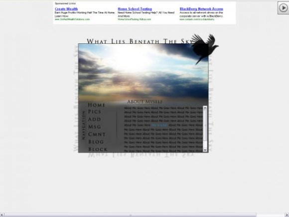
I agree with Niko that this should be centered.
Also, grammatically speaking, I think this should say "what lies beneath the sky."
Posted by tokyo-rose on Sep 1, 08 1:21 pm


atleast rollovers if your using single images already
Posted by Absinthinjector on Sep 1, 08 9:34 am


Awesome banner, but I think it would look better without the repeat of WHAT LAYS BENEATH THE SKY. Also would look better if WHAT LAYS BENEATH THE SKY wasn't in all capitals. :S
Posted by Naekipz on Sep 1, 08 3:03 am

I really like its simplicity. imo, it would look better if it was centered. &the nav is a bit boring. But, i love the concept &whole feel to it. i really like the image on the top &the text around the whole box[:
Posted by nikx618 on Sep 1, 08 2:33 am
« Prev ·
Page 2 of 2
Add Comment
You must be logged in to comment
Layout Details
| Designer |
icedog0
|
| Submitted on | Aug 31, 2008 |
| Page views | 30200 |
| Favorites | 285 |
| Comments | 30 |
| Reviewer |
manny-the-dino
|
| Approved on | Sep 1, 2008 |