Beneath The Sky (Rollover) (comments)
Displaying 1 - 20 of 30 comments

Oh my
that was freaky
I was listening to music
and the song i was listening to was the song that was on my profile
but nice profile!


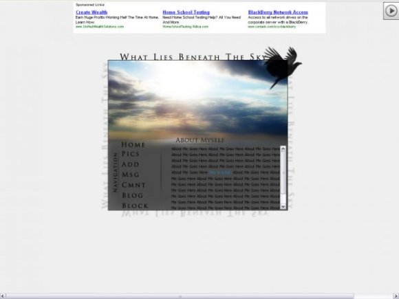
This is beautiful!
I adore your about me, I read all of it.
&& I would absolutely love to get to know you.

Hello.
well im pretty new
at this and i
just wanted to say that uhh,
this is magnificant.
i love the photograph,it
looks peaceful,
and i kind of read your
about me.haha.
:)
and photography is
amazing.
well uhh,
fantastic job:)
i love this layout/cover up. what ever u wont to call it. I really love it. u did a great job!


don't listen to the comments my dear.
i think you're pretty gorgeous along with this banner ;]


reminds me of allvanishings layout, but I like it nonetheless :]
I love this one!
The photograph and the contrast of the sun and the clouds are amazing.
I think I like it best because it's so simple, yet it's beautiful as well.


oooh nice image
i think it'd look better if u fade it more between the banner and the content area.
u should align home and about myself.
i think it'd look more structured.
try to add a bit more colors.
if the rollover color was a bit darker, it'd look better since the navigation background-color is really dark.
however, amazing layouts.
can't wait for ur next one.

lmao no there isnt you obiously did something wrong
my myspace is
www.myspace.com/trevorsa koolkid
go to it and see

i love it now, but the only problem is...
when you actually use it, there are light blue boxes around the navigational buttons. you should probably fix it.
Add Comment
You must be logged in to comment
Layout Details
| Designer |
icedog0
|
| Submitted on | Aug 31, 2008 |
| Page views | 30200 |
| Favorites | 285 |
| Comments | 30 |
| Reviewer |
manny-the-dino
|
| Approved on | Sep 1, 2008 |