The Lost City (comments)
Displaying 1 - 12 of 12 comments

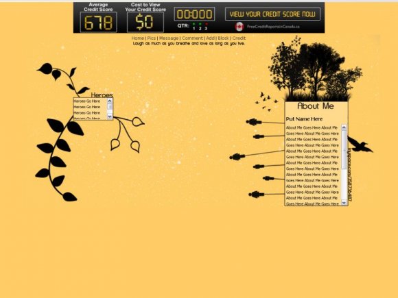
Great job! This is an awesome layout!! I was just wondering if there was any way to take out that Heroes box, or even just rename it...it kind of doesn't fit.
i would love love love if the about me was a bit wider i have youtube vids i like to put on my profile :/ but great job i know i can't make a layout

Very nice. Ehh, a bit small but still really good. Great job. :)

Oh the statement on the layout is inspirational, too. XD :)))


Very Unique!
I wouldn't have used heros for the other scrollbox... but then it's not my lyt! GREAT JOB!
This is awesome. It's just that if you leave your mouse on the picture, "photobucket" pops up. You didn't take out the words in the code which you should have. It gets kind of annoying.
I love this! If i can figure out a way to get rid of those words i'll totally use it!!! It's so different.

I really like the simplicity of this.
I just think it's kinda weird how "Heroes" is sorta randomly there on the left.


Add Comment
You must be logged in to comment