A Light In The Dark (updated) (comments)
Displaying 1 - 17 of 17 comments

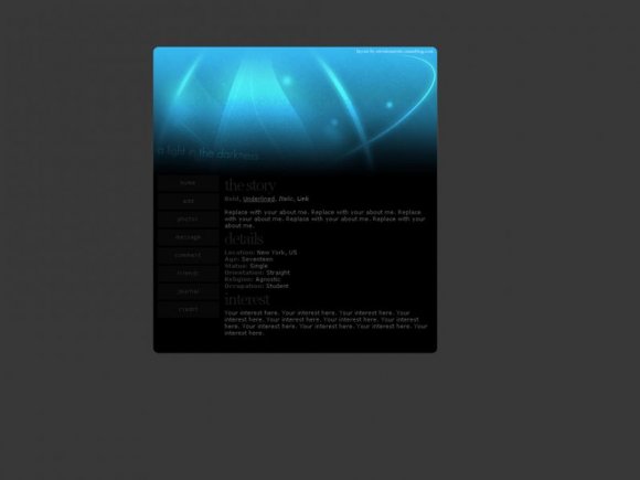
I love the black on blue effect. I think it goes quite well. :)
I adore the image. It's very original and i like the way you have the text at a slant. It gives off an air of uniqueness. Kudos to you ^_^


Question.
The player is sticking out awkwardly.
Any fix for that?
I'm using Safari on OS X.

This is really nice. I like the navigation.
I think it might look better if it were a little bigger? -shrug-
Thanks buddy! This is a great layout. I will use this up until I get the time and the unlaziness to create my own. :P
Once again, very nicely done.


This is so pretty! Ièd love to see the blue graphic as a wallpaper too haha.

Unfortunately, Safari on Mac doesn't quite like this one. But otherwise... it's very nice. I just wish it worked. *sigh*


really cool i like the blue your used ^_^

Add Comment
You must be logged in to comment
Layout Details
| Designer |
melancholiclights
|
| Submitted on | Aug 23, 2008 |
| Page views | 18104 |
| Favorites | 127 |
| Comments | 17 |
| Reviewer |
manny-the-dino
|
| Approved on | Aug 23, 2008 |