Designer's Comments
Look carefully for specific instructions
Replace XXXXX With your friend ID
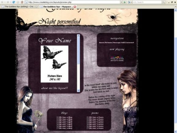
I decided to re-do this layout because the Nav was all cluttered with the "Now Playing" and the Blog...
I added in a section for your blogs,
but I divided the DIV box in half so now
you have room for more links.. in my case I put poems in mine.
For the most part you're on your own for everything else.
(: Notify me if anything goes haywire.
RESOURCES:
Poem:From Sing-Song by Christina Rossetti (1830-1894)
Nyx Girls:http://gallery.aethereality.net/list/series/190/
Background:http://sheisprettystock.deviantart.com/art/the-blues-86726241
Using This Layout
For specific instructions read designer's comments
- This is a div overlay layout, html knowledge required!
- 1. Log into myspace.com
- 2. Click on Edit Profile (Profile 1.0)
- 3. Copy (ctrl c) and paste (ctrl v) code to the specified fields
Layout Comments
Showing latest 10 of 12 comments

i'm like ooberly obsessed with this series =D is there a way to get rid of the blog and poem thing on the bottom?
By gordonfan2428 on Sep 19, 2009 12:53 pm
omg i love this series! I'm gonna use this =DD
By gordonfan2428 on Sep 19, 2009 12:50 pm

I reeeeeeeally really love this layout. I just don't know if I want to use it xD It's a battle of the lays! :o
By miila on Apr 28, 2009 8:53 pm
this is really nice.
By time1 on Sep 23, 2008 4:01 pm

lovely lovely
great job :]
By oRdinary on Aug 25, 2008 5:45 pm

using now!
By hemophobicvampire on Aug 24, 2008 9:07 pm

I agree with using a different font for the top. But it's nice.
By futura on Aug 24, 2008 2:20 pm

its gorgeous :]
great job
By bloodbath1313 on Aug 24, 2008 1:56 pm

Oh so pretty! You did a lovely job.
By asinglewhisper on Aug 23, 2008 7:28 pm

must be allot of work verry cuttteeeeeee
By xxSweetAngelxx on Aug 23, 2008 4:46 pm
Layout Details
| Designer |
KatastropheKris
|
| Submitted on | Aug 22, 2008 |
| Page views | 15,930 |
| Favorites | 131 |
| Comments | 12 |
| Reviewer |
schizo
|
| Approved on | Aug 22, 2008 |