Glass Skin (comments)
Displaying 1 - 20 of 22 comments

Awesome layout, but is it possible to create an overflow for just the area where the Mushi lyrics are (not including the other text)? I've tried to make the text overflow, but the coding just makes it disappear :(


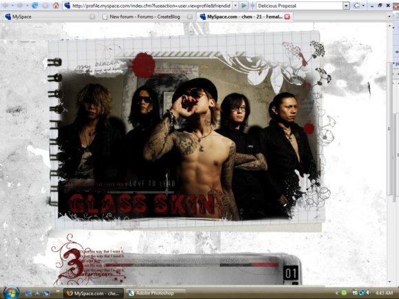
Such a friggin awesome layout! Kaoru is super SMEXII!!!!!
XD


nav is pretty hard to see but this layout looks amazing!

I LOVE THIS LAYOUT SO MUCH XD You should make more Diru layouts XD

Love this ! And Kaoru's emoness is looking mighty HOT!

This is awesome. I feel retarded, but I am guessing that they are a band?


Love the images. My only problem is you can see the seam of the bg and i think it might look better if it were set to scroll instead of fixed?
other than that i ♥ it xD
-DH
love it! everything was awesme i just changed the two headings "Irail at the sordid you," and "Something' missing from my mind," to Love me the marrow of my bones and again in japanese ^___^ it's a personal favorite of mine.
Oh great.
Now every one is going to have the same picture of Kyo as me.
-.-"


This is a great layout- the brushing is all awesome! I love the font you used for "Glass Skin", and all of the other fonts work nicely. My only criticisms would be that there's some edges left on the banner. That, and a pet peeve of mine is having banners detached from the content area- but that's just personal preference xP
you did an amazing job with this!


Add Comment
You must be logged in to comment
Layout Details
| Designer |
Saikou
|
| Submitted on | Aug 1, 2008 |
| Page views | 14257 |
| Favorites | 68 |
| Comments | 22 |
| Reviewer |
karmakiller
|
| Approved on | Aug 3, 2008 |