Dream that the universe is ours (comments)
Displaying 1 - 18 of 18 comments


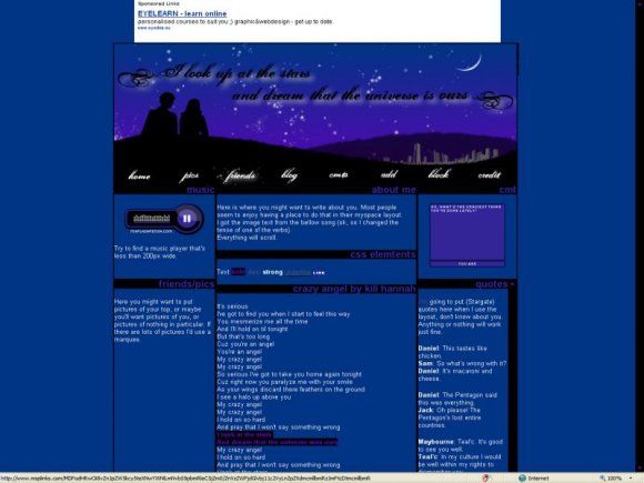
this is awsomee. the roll-overs are a nice touch. (:
like the nav font toooo.

meant to say i absolutely love your layout. But when i put it on my boyfriend's myspace, because it was blank, it turned out all weird. here is his link. http://profile.myspace.com/ind ex.cfm?fuseaction=user.viewpro file&friendid=10347303&MyToken =8e58770d-ee79-4dd7-baf7-87946 460246b


yes. I agree the banner isn't really attractive. well on the other hand the message is [: thanks for your hard work lubb.

The rollovers are cool, but the top image isn't the best quality. It's a bit blurry.


I love the colors.
And the top banner is really good, you did a great job. I love the little skyline, haha. =]
(I can read the text fine too.)

Black text on dark blue (in banner) is hard to read... I don't like the colors in this layout but the quote is nice. :]


i love the crazy angel song.
and i've got the preview opened, listening to the playlist.
lawl. :)).

not too fond of the color scheme. D: and the text in the top banner. but it's a nice concept. :)
Add Comment
You must be logged in to comment
Layout Details
| Designer |
SJalways
|
| Submitted on | Jul 31, 2008 |
| Page views | 12522 |
| Favorites | 113 |
| Comments | 18 |
| Reviewer |
karmakiller
|
| Approved on | Aug 1, 2008 |