Notebook (comments)
Displaying 21 - 40 of 49 comments


I've been trying to fix the navigation with the "z-index: 99;" thing, but everytime i save it, it changes to "...;". Every single time! So i need another solution, i've read the red text in your description. But still, isn't there a way to fix it? Because i really like this layout ^^!


ITS KEEPS SAYING INVALED USER. I KNOW YOU SAID, REPLACE THE XXXX WITH YOUR ID, BUT I ONLY FOUND ONE WITH XXXXX AND THAT WAS IT, CAN YOU HELP ME, PLEASE.

i know wut you did wrong!! when you were making the layout you put the links of the nav. bar in the back of the picture and put them in the wrong position!! thats all that is wrong with the nav. bar!! so yeah... fix it fix it!! xD lol
nav bar doesnt work but who cares myspace has that new shorcut stuff on the top of every page!! xDD so yeah... prob. solved!! xDD

i love it and might even use it without functional navi.
But, I still hope you fix it :)

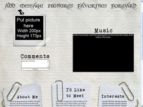
I got everything to work okay on it except there's an error when I add the playlist to it. For some reason after posting my playlist it takes out the video and the about me, interests, and i'd like to meet section.
i love the preview of this layout but when i saved the code it looked nothing like the preview :(


^^
navigation not work u_U
pleaze check it ^^
thankz
iz awezome the layout :D

i love everything about your profile dude. thank you for centering it. and everything else rocks.

yeah i used margin left:50% for the background but not for the scroll boxes but i'll fix it

Same here, everything is misaligned. Only because it seems you have the background centered for all screen sizes but the text doesn't follow. just copy whatever you did for the text for the background image.

its nice.. but it doesnt line up. and then um.. the pin, it kinda ruins it by being totally cartoon :/

the text is a little off. It may be because of browser or screen resolution for the screen resolution positioning, its best to use a 50% margin. the design itself is a nice idea, but coding has to be checked in several browsers for problems
ohh and pictures is not spelled wrong, if you really look at the word 'C' & 'T' are not the same so yeah...
Add Comment
You must be logged in to comment
Layout Details
| Designer |
pandemonium
|
| Submitted on | Jul 14, 2008 |
| Page views | 85079 |
| Favorites | 840 |
| Comments | 49 |
| Reviewer |
Relentless
|
| Approved on | Jul 14, 2008 |