Designer's Comments
Look carefully for specific instructions
Replace the FRIEND image AND url to make the friends area work.
Profile best viewed in FireFox on 1280 x 1024 screen resolution.
This is an advanced layout. Do not alter unless you know what you are doing.
Visit my website for over 60 FREE div overlays for myspace. Custom also available.
www.emarielayouts.com or email eMarie2470@gmail.com
-----------------------------------------
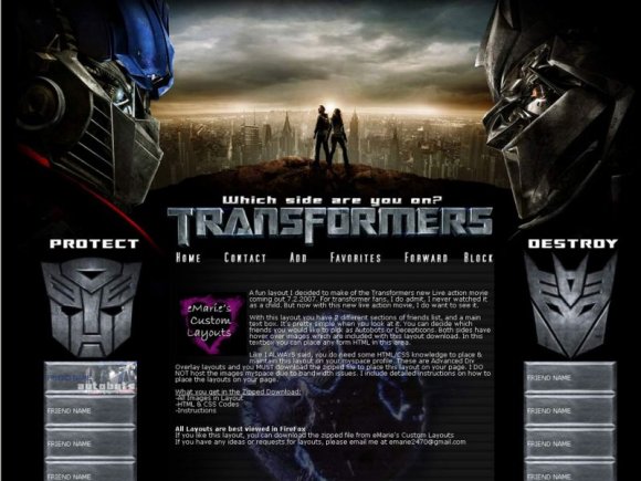
NOTE: I made this layout when the movie came out a while ago. The coding may be a little outdated unlike the things
I'm doing now. BUT the design was prettier popular at the time so I'm adding it to my Createblog collection.
ALSO....
Everyone is saying its miss aligned in IE or FF, well. Its NOT the browsers, I checked. The problem is the Screen Resolution. I try to check my layouts in both FF and IE to make sure its aligned properly. For IE, it should be the latest version, if you have older versions it might not look right. Also, please notice the screen resolution specs. That is the best resolution to view it in.
Using This Layout
For specific instructions read designer's comments
- This is a div overlay layout, html knowledge required!
- 1. Log into myspace.com
- 2. Click on Edit Profile (Profile 1.0)
- 3. Copy (ctrl c) and paste (ctrl v) code to the specified fields
Layout Comments
Showing latest 10 of 10 comments

favorite.

super awesome

Oooh, I love this layout, and I would use it if it wasn't misaligned (in IE)! Such a great movie.

oooooooooooooooooomg!! i love the movie. lol rofl!! instant classic bby. awesome layout dude.

It looks nice, and yes...the movie was awesome, but not enough creativity, and misaligned in FF and IE.

this movie was fuckin awesome!

ooh very nicee. but ya its a little too big for some screens

this movie was awesome. i kind of like this, but i think everything looks kind of crowded. if that makes sense.

Misaligned on IE, good concept - but appears to be a continuation of a wallpaper.

I like it... but it's quite large so it doesn't fit very well on my screen... and it's misaligned on firefox (I haven't looked at it on ie yet...)
Layout Details
| Designer |
eMarie2470
|
| Submitted on | Jul 12, 2008 |
| Page views | 11,033 |
| Favorites | 48 |
| Comments | 10 |
| Reviewer |
Relentless
|
| Approved on | Jul 13, 2008 |