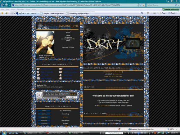
Designer's Comments
Look carefully for specific instructions
PLEASE READ:
• Tested in IE and Firefox
• Looks best in 1280 x 960 resolution
• Found this animation around the web lol. Forget where. I don't take credit for it.
• Brushes from Saruna.net & other places I can't remember. I don't take any credit for them.
*PM me if you need any help.
Using This Layout
For specific instructions read designer's comments
- 1. Log into myspace.com
- 2. Click on Edit Profile (Profile 1.0)
- 3. Copy (ctrl c) and paste (ctrl v) code to the specified fields
Layout Comments
Showing latest 8 of 8 comments

I love this layout..^_^

Im not sure I fixed it right but its closee..
[Background properties]
background-positi on: 200px 420px;
background-repeat:non e;
thats the closest I got.. doesnt look like the preview on my page on myspace but minus my pictures I got on my page.. It'll probably look like it.

the background isent centered in fierfox
but its really good imma try & fix it myself
so i can use it good job on the extended network
i also think the extended network looks good(:

these is nice :)
i like the motion picture effect

i really like this layout
:)

it's mis-aligned in firefox but from the preview it looks good.
The extended network banner is the best in this, in my opinion, great work!
Layout Details
| Designer |
imperfectionistx
|
| Submitted on | Jul 12, 2008 |
| Page views | 12,874 |
| Favorites | 47 |
| Comments | 8 |
| Reviewer |
jaeminnie
|
| Approved on | Jul 12, 2008 |