Swing It All Away (comments)
Displaying 1 - 20 of 22 comments


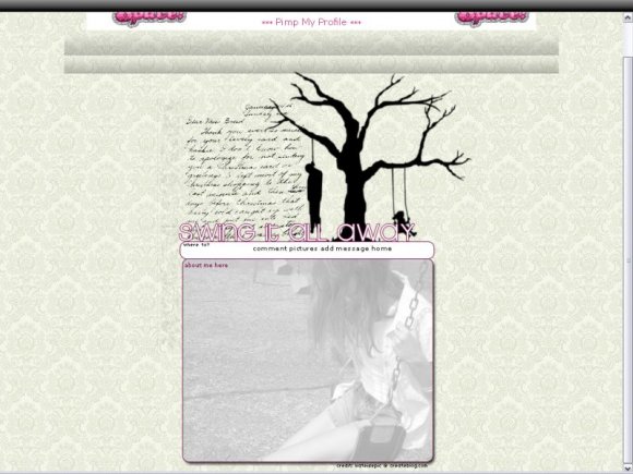
I do love this, just the "swing it all away" font irks me. To me at least, the font there is girly while the background is quite...well, not. And I do hate to classify something as "girly", because I hate stereotypes, but it's just the first thing that stuck out to me. However, I do like this and if I decide to stop making my own layouts, this will definitely be first up for my next one. Nice job.


Well, it was meant to be simple. And putting the top across the whole background would look too...bizarre, and not to mention the brushes would end up being distorted because they aren't that big.

loving this layout. i just wish there was something on the sides so it wasnt too plain. i would have liked it better if the note up the top was part of the bkg and spread across the sides and behind the about me.
but i still love it. great work.
Naekipz, no. I will not try something different. =] Black font would blend too much with the tree. Grey would be over-doing the grey. Besides, grey is just white with black, I used a neutral color nonetheless.
Myhappyending, thank you =D I tried to make the navi centered, but, it just didn't work out correctly. Lol. =]

I love this. It's simple but good. I think the navigation could have been better though, more sort of, centerish or whatever?
Kudos :]

"Swing It All Away" should be written in black or dark grey. I don't know, it's just something about the font that makes me not like it. Try something different?
that tree silhouette... does it happen to be on a t-shirt from threadless.com? anyhow, i love this.

Could've done a little more with the navigation but, I really love the design and the faded photograph in the about me. :]

I like how you used an image for the background of the about me. :)


wow... i like it but at the same time it makes me sad. 0_0 still a very nice layout though.

i love how the image is completely transparent :] and it like slides down the background
very good missy.

>_> mk. I know it says there's green, but there's not. I must've clicked it by accident. deal with it. lol.
Add Comment
You must be logged in to comment
Layout Details
| Designer |
kateisepic
|
| Submitted on | Jul 7, 2008 |
| Page views | 27073 |
| Favorites | 231 |
| Comments | 22 |
| Reviewer |
jaeminnie
|
| Approved on | Jul 7, 2008 |