Passport to my Heart (comments)
Displaying 1 - 20 of 22 comments


This is one lovely layout!
Hope you don't mind if I use it?
Thanks honey!
=]]]
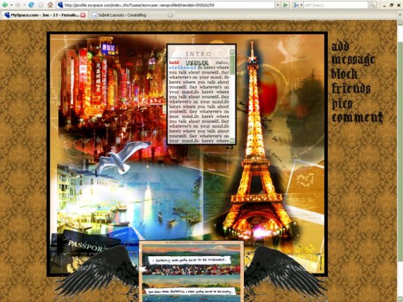
Im having trouble putting text in the white box in the center of the layout..what should i do?
hey this is a very nice layout
i used it for my myspace
but theres no link on how to go back to the home page
can you please fix it?
ive tried but i dont know how
thanks =]

a LOVE this layout LoTs
and im currently using it on myspace
but the area to write is quite small
it has a TON of potential
redo it?
with only a few changes
because i love love LOVE it so much
its gorgeous


I love this layout, but I can't get the navigation to work.

this is really lovely. but the text box is a little small for me. but other then that, this is awesome.

This is nice. I like the colors. The navigation isn't working for me, though. You need to put a # before the x for the usemap part.
so creative. i like the concept here. the colors fit well together and it's just very artistic. i'm not a fan of the winged box at the bottom, but other than that, a very nice layout. i love the navigation.

I'm not really feeling this one. I really like the concept of it, but It's a little too much for me. Also, it's giving me a horizontal scrollbar.
The layout itself is very big and the content area is very small. I think the image and colors are overwhelming, too. You should try darkening the background pattern. Lastly, the wings on the bottom aren't cut very well. I can see all the speckles. All in all, it has a lot of potential- I'd really like to see you redo this layout, with a few changes here and there, the concept is awesome! :)

The content box is a bit small... but nice image! I like the bottom part a lot. :D
Oh hey! I really, REALLY love this layout and I added it to my myspace today and added all the codes right and all but my music player doesn't play. It just shows up as three dots and doesn't do anything other than that (doesn't play.) I'm using a music player from Myflashfetish.com and I'm not sure if there's a specific kind of music player than you can only use for this layout or if the one I'm using isn't compatible with this layout but I really love it and it would make it perfect if I could get my music player to work so if you have any idea about what went wrong with the music player , then thanks a lot~ xD
~Rena-Chan :]


Add Comment
You must be logged in to comment
Layout Details
| Designer |
StaticPulse
|
| Submitted on | Jul 2, 2008 |
| Page views | 44122 |
| Favorites | 546 |
| Comments | 22 |
| Reviewer |
karmakiller
|
| Approved on | Jul 3, 2008 |