Hollister DIV (comments)
Displaying 1 - 17 of 17 comments

Lovely layout!
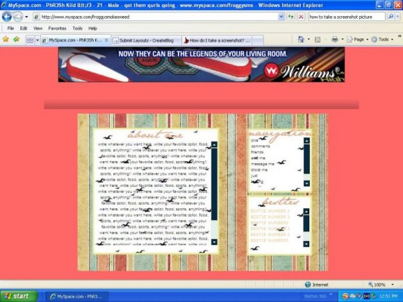
The colors don't go well though. The background color is just like.."Where did that color come from?!" and the next is very hard to read.
I really like it though *faves*

Hollister should be kind of proud. I mean the text. Come-on who can read that?


you submitted this layout on my birthday.
lol.
but its cute.
love everything,except how do you change the color of the text,it's orange and it's to bright to be able to read,please reply....^_^

i was wondering why my fonts isnt working. Reply please =)
i like the idea, but the background color is much too bright for the rest of the layout. i do like the font choise though. :o)

The color scheme is very pretty, but the text is nearly impossible to read for my poor eyes! You should make the Hollister pattern orange and the text navy blue- I think that would improve it a ton! Also, it just gets cut off. You should add a 1-3px border to the picture, and look for a small pattern for the background to give some more texture- squidfingers.com has really nice ones. ;)
I used that background in my So Lovely Scrapbooking. I can provide you a better quality I hope. Feel free to ask.

the hollister background is fuzzy.
where did you get the brush for that? ^_^

hahah hollisters like one of my favorite stores at the mall!! ツ


this is an awesome layout! IT PERFECTO! lol I absolutly LUV IT!!!! :)
Add Comment
You must be logged in to comment
Layout Details
| Designer |
doubledutchlyts08
|
| Submitted on | Jul 2, 2008 |
| Page views | 28450 |
| Favorites | 153 |
| Comments | 17 |
| Reviewer |
karmakiller
|
| Approved on | Jul 2, 2008 |