City of Dreams (comments)
Displaying 21 - 37 of 37 comments


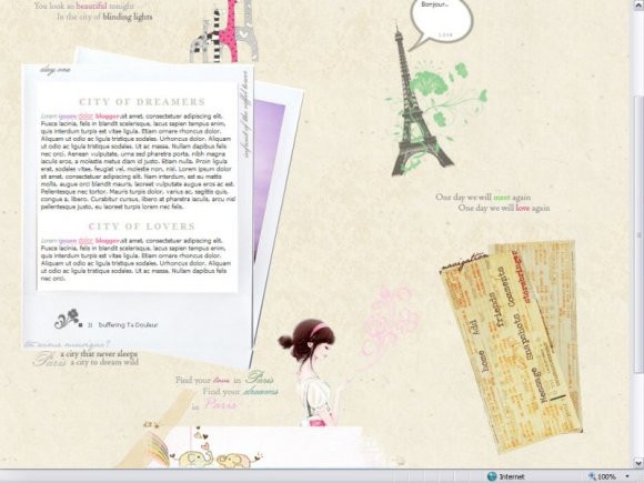
The grey background would look better if it were a shade closer to the original image bg. It also looks a bit empty... maybe more stuff could've been added on the image. Over all, this is a pretty layout though. :D

this is a really amazing layout!!!!
should do these kind more often!!!!!
nice job!!!!^.^


where did you get the music player???
pleez reply ASAP!!

Other than the fact that the background doesn't continue on bigger screens, I really like this. Great job. :)


Nice, and I tested it on my private test profile, and it works great on MySpace. The previewer here on cB is garbage, that's why it don't look right.

I'm sorry, the createblog preview is a little wierd, but if you need to see that it works on a real myspace, I included a link to a myspace where I test all of my codes. Everything looks fine in my screen, i'm not sure if it's just your computer or if you just didn't click refresh (that usually fixes a lot) but I think that my coding is fine. :D

i like the idea, really nice, but is there supposed to be more of a background? I didn't see anything else load and the right section of the page is just gray, not meshing well with the design. and i don't know if its just the page load up but the layout is a little too high and is covering the ad area. not sure how it will look on an actual myspace, but thats something to be concerned about. also the comment box area is being blocked a little. all in all, the idea and design are cute, but the coding needs to be worked on.


this is really adorable. but the comment box is out of bounds
Add Comment
You must be logged in to comment
Layout Details
| Designer |
stormbringer
|
| Submitted on | Jul 2, 2008 |
| Page views | 46053 |
| Favorites | 581 |
| Comments | 37 |
| Reviewer |
manny-the-dino
|
| Approved on | Jul 2, 2008 |