Vanilla (comments)
Displaying 1 - 15 of 15 comments

I agree with DECODE & DREAMGURL36. You have the skills, NICKAWHAT, but this isn't a layout. It's just...like Decode said...you put "About Me" on a white background. And the color of the About Me section doesn't match the white background. Now, with that said, I do like this because it is very clean looking and crisp, fresh because of the white.


There is no regular navigation bar. The preview looks exactly like the screenshot.

the regular nav bar thats suppost to dissapear is still there.its messing up the layout.but other than that its nice.

OMFG it appears blank on my profile, i guess it is really simple

It's far too simple. It's like having a plain background and then just putting a div box with 'about me' on top.

hey so i gotta hide ad code. i'd post it but..bad anyway if you need juss lemme kno

It's a bit too simple for me, but I like how you did the nav.

i like it but its a little
to plain for me!
good job though!
:)

Nick dude!
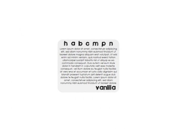
Love the new layout... could have done w/o the word vanilla though, makes it a little girly.
Add Comment
You must be logged in to comment
Layout Details
| Designer |
NICKAWHAT
|
| Submitted on | Jun 30, 2008 |
| Page views | 19031 |
| Favorites | 68 |
| Comments | 15 |
| Reviewer |
Synesthesia
|
| Approved on | Jul 1, 2008 |