Picnic (comments)
Displaying 1 - 20 of 24 comments


I adore this, if only it was a website lyt.
but anyways, I love this, bravo.

This is really cute, And I love the background.
It's all over simple and awesome [:


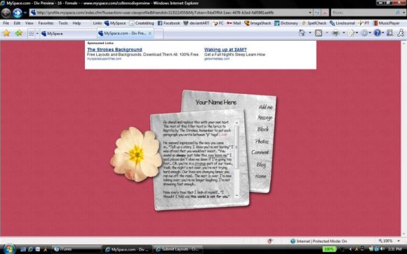
eMarie2470, the preview is wrong - it uses a version of myspace coding that is outdated. I made note of it in my comments above. If you put the code on myspace, it looks fine.

I like the idea of the design, but you should have used a colored back for the image instead of a transparent background OR you need to adjust the coding to clear everything off the page to make it work better. in the preview i can see the old layout bleeding through.


i agree with everyone else, you made comic sans look good. that's an accomplishment.

Hahaha, I usually hate Comic Sans MS too, but I love the way it looks with this. It just... Fits. :)


I think the comic sans goes well with it, as a font. It's the style that counts. And I enjoy it. Great job. No need to change anything, in my opinion.


Cute. I agree though. I don't like the comic sans. but it's still cute. :D
Add Comment
You must be logged in to comment
Layout Details
| Designer |
CrotchetTheLeper
|
| Submitted on | Jun 28, 2008 |
| Page views | 28319 |
| Favorites | 270 |
| Comments | 24 |
| Reviewer |
Relentless
|
| Approved on | Jun 28, 2008 |