Designer's Comments
Look carefully for specific instructions
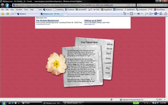
Please not that the CB preview is wrong. The interests table etc. does not show on the current version of myspace. Also, this layout hides the new myspace navigation.
I wouldn't suggest using this layout if you're not experienced with CSS or HTML.
Everything you need to edit is in the "Who I'd like to meet" section of the code. Remember to replace the "xxx"'s with your friend ID. Get your friend ID here!
Please don't remove the credit, as always.
Any questions? Leave a comment.
Enjoy!
Using This Layout
For specific instructions read designer's comments
- This is a div overlay layout, html knowledge required!
- 1. Log into myspace.com
- 2. Click on Edit Profile (Profile 1.0)
- 3. Copy (ctrl c) and paste (ctrl v) code to the specified fields
Layout Comments
Showing latest 10 of 24 comments

this is sooo awesome:]

Cute and simple.

I adore this, if only it was a website lyt.
but anyways, I love this, bravo.

This is really cute, And I love the background.
It's all over simple and awesome [:

This is ahh-mazingly cutee!
I love it! :DD

hellppp?

i love it.
the song is great too.

dis is cute!!

eMarie2470, the preview is wrong - it uses a version of myspace coding that is outdated. I made note of it in my comments above. If you put the code on myspace, it looks fine.

I like the idea of the design, but you should have used a colored back for the image instead of a transparent background OR you need to adjust the coding to clear everything off the page to make it work better. in the preview i can see the old layout bleeding through.
Layout Details
| Designer |
CrotchetTheLeper
|
| Submitted on | Jun 28, 2008 |
| Page views | 28,317 |
| Favorites | 270 |
| Comments | 24 |
| Reviewer |
Relentless
|
| Approved on | Jun 28, 2008 |