Touch the Sky - Fixed (comments)
Displaying 1 - 13 of 13 comments

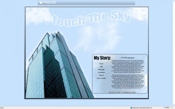
I've got vertigo and I actually feel a little dizzy
looking at that building image.
Love it!
Nice clean layout.

It looks good. Only thing is that I think the box you have the text, I think the diagonal lines should be less opaque. Also, you should the move the background left some more and down so that it doesn't cover the advertisments and doesnt have a bottom scroll bar (I have issues with those XD) but other than that it's a really good layout. Well done :]

No, I dont see a scrollbar in the middle of the page.
You must be using mozilla firefox which see's everything I.E7 diffrently.

I love it. (It's easy for me to read, as well). The only thing I dislike is the scrollbar across the page, is that happening to anyone else?

I can read everything fine. I dunno why others can't.


sorry, my first div layout for creatblog. I forgot about the advertisement thing.
I usually take it off and diddnt really care about getting deleted, sorry folks..


Good job, but the background hides some of the advertisements. You can't hide any of it, otherwise the result is deletion. So I just wanted to let you know that. But you still did a good job.

Thats really nice. (I love skyscrapers) The only thing that bothers me is the backround behind the text, it kind of makes it hard to read..
Add Comment
You must be logged in to comment
Layout Details
| Designer |
Discrated
|
| Submitted on | Jun 26, 2008 |
| Page views | 11168 |
| Favorites | 51 |
| Comments | 13 |
| Reviewer |
karmakiller
|
| Approved on | Jun 26, 2008 |