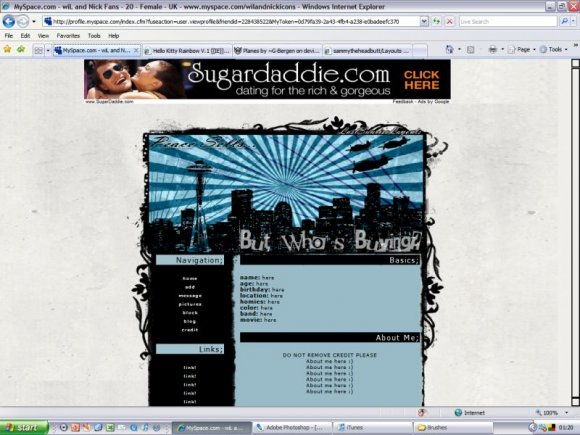
Peace Sells. ((IE)) (comments)
Displaying 1 - 17 of 17 comments

This is pretty but like everytime i hit "home" it goes to someone else's myspace.
i need help!
please & thank you


Awesome layout! It's completely my style. I really like the top picture of the skyline.


yes! another seattle layout!! right on :D i've only found two (including yours) this makes me happy!!

i cant get the links to work. where do you enter you friend id?


This is pretty nice, but the banner is blurry, but big props for the Megadeth theme.

i like the colors, design & concept. the only things that brings it down is that it is a bit blurry. other than that i think you did an awesome job. :)

hey Paintmyface, i have the same screen rsolution as you and mine appears okay with no scrollbar along the bottom,
so im not sure what that could be?
i will probably work on this layout further sometime as i am well aware that it isnt my best,
as for the blurryness, im not sure what that would be, the image isnt stretched and its saved as a png, but again i will work on it...
thanks for feedback everyone!
Yeah it is a little bit blurry. The font don't really suite it, in my opinion. And well... the navigation would be better if it was rollover images, or image map. I suggest making custom font for designs, or edit current fonts, making them blend better with designs. The longer you take making something, the better it turns out, usually. That is if you take pride in what you do. It's good though, I will favorite it.
It's cool, but it's got a scrollbar going along the bottom for me, and when I move it, it moves the bottom of the image...?
I'm using IE and a resolution of 1024x768...?
May just be my computer at the moment!
Favouriting it anyway. =]


Add Comment
You must be logged in to comment
Layout Details
| Designer |
SammyTheHeadbutt
|
| Submitted on | Jun 24, 2008 |
| Page views | 22088 |
| Favorites | 146 |
| Comments | 17 |
| Reviewer |
manny-the-dino
|
| Approved on | Jun 25, 2008 |