Designer's Comments
Look carefully for specific instructions
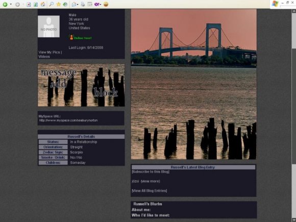
The top picture is a stock picture of Throgs Neck Bridge.
The background image is one the great Canadian artist's, Viannen's. The Crooked Stroke.
I just played with the contrast and blended a bit.
Using This Layout
For specific instructions read designer's comments
- 1. Log into myspace.com
- 2. Click on Edit Profile (Profile 1.0)
- 3. Copy (ctrl c) and paste (ctrl v) code to the specified fields
Layout Comments
Showing latest 9 of 9 comments

No matter what anyone says i personally love this layout because it brings back memories when i lived in the city... & i hold the those memories close to my heart so thank you

takin it to the bx...niice

I love the images, but the background bothers me.
It's so...
plain.
It takes away from the feel the images leave.

WOW. The EN banner is stunning. The images are just amaze :)
x

!!! Amazing images; I spent a large part of my childhood swimming in that water! :D

The image is interesting. :)
Thank you for the comments my friends. Yes! The aim with the contrast was to give it a kind of "surrealistic" feeling. The way only Sun can paint. :)

i like it. i think the extended network banner looks good with the contrast added.
the extended network banner could use a little more work, and it's not in very good quality. maybe adding some fonts to it, and saving it as a .png? [:
Layout Details
| Designer |
Katinka
|
| Submitted on | Jun 15, 2008 |
| Page views | 13,898 |
| Favorites | 83 |
| Comments | 9 |
| Reviewer |
Synesthesia
|
| Approved on | Jun 15, 2008 |