Binder Paper (comments)
Displaying 1 - 20 of 29 comments

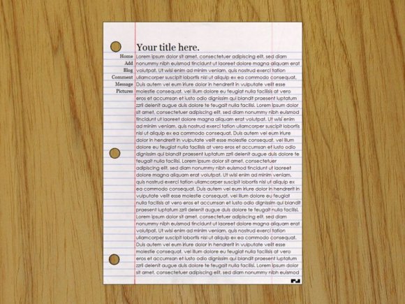
Te paper doesn't look yellow. I don't know what MACABEE (guy with thumbs up, third responder down) is talking about- maybe it's his computer. Idk. I think it looks good. There sure are a LOT of these paper layouts with just the plain paper and "About Me" and stuff.


Could have done some lighting stuff to make the paper look white not...yellow...but a good concept...but it kinda ruins the idea cause the background is fixed...and the background is like to far zoomed its weird...


everythings good but the title i had to change the line height to get it right. but altogether aight i guess

i ise ie and i looked at the preview and it didnt show a paper it was just a line in a shape of a box with an x like the image had been delted..

i like it a lot! but i have only one question. id like to put a quote where the title is but when i do it, it stays on the left? how can i make it go straight across? thanks.
I love this layout! It is the coolest! I like how it looks like it is on a desk too! haha =] I love it!


a lot of ppl did dis..
but urs look tons better!!
5 stars =]

The title is also cut in half for me. I love how everything is perfectly aligned. Great job! =)


i like this one better than most of the paper layouts. its very simple. but on my preview the title is chopped in half

I like it...I'm not saying you're copying anyone or anything but I've seen similar ones also...however, this is the best notebook page type I've seen yet. =)


Add Comment
You must be logged in to comment
Layout Details
| Designer |
NICKAWHAT
|
| Submitted on | Jun 13, 2008 |
| Page views | 124366 |
| Favorites | 575 |
| Comments | 29 |
| Reviewer |
Relentless
|
| Approved on | Jun 14, 2008 |