Designer's Comments
Look carefully for specific instructions
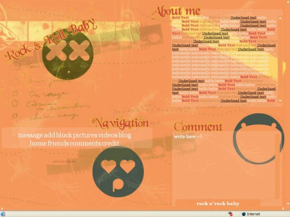
1024 x 768 resolution
+ **BEFORE YOU SAVE ON MYSPACE** change "XXXXXX"s to your friend ID. - if you do not then it will change to msplinks and you will not be able to change it unless you re-paste.
+ fill out the module :)
+ you can change what the comment box says (the "write here") & navigation (order or delete a link) if you would like. And if the positioning is off you may change that, but do not change any of the other content.
+ keep credits on
+edited june 15, I fixed the comment box, but when i preview the layout it's just as orange background, unless i put it in the heros. =/..so if you use the layout, i'm not sure what to say to do.
Using This Layout
For specific instructions read designer's comments
- This is a div overlay layout, html knowledge required!
- 1. Log into myspace.com
- 2. Click on Edit Profile (Profile 1.0)
- 3. Copy (ctrl c) and paste (ctrl v) code to the specified fields
Layout Comments
Showing latest 10 of 11 comments

I soooo love this! it fits me so well!
I'm using it right now. ^_^

Do music player work on this layout?
i love the smiley with the hearted eyes its soo adorable XD

hey dude, i'm putting in my friend id correctly bcuz all the other links work but the "comments" doesn't work. Keep giving me that display
Your comment box is messed up. It shows a blank box and doesn't have the icon to post the comment
The preview looks awesome, but the comment box doesn't work and the about me text is aligned to the left a bit too much.. =/ And I'm using a 1024x768 monitor as well... =/

i really like this, its super cute. the colors are really awesome.

I am on a wide screen monitor, and the nav is way over to the left. but when I go on my reg size screen, it lines up. so I think something is wrong with your positioning.

unique!
:)

This is really cool. I like the concept and I love the colors. I'm quite fond of the nav, too, although I usually don't like it when the nav in a layout is so large. Good work. I love this.
Layout Details
| Designer |
sarcasticserenity
|
| Submitted on | Jun 11, 2008 |
| Page views | 11,841 |
| Favorites | 106 |
| Comments | 11 |
| Reviewer |
manny-the-dino
|
| Approved on | Jun 11, 2008 |