Music was her Life... (comments)
Displaying 1 - 14 of 14 comments


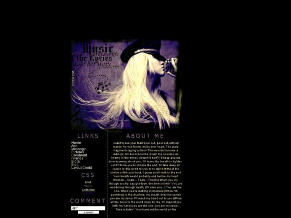
nice i like it. the image is overlapping the content a bit. instead of "layout credit" try "credit" because when u hover, it goes to the next line, moving the left column up and down. its a bit obnoxious. nice color choice. by using a purple theme, you made the blonde shine and attract more attention. nice brushwork. cant wait till ur next layout. gj
Posted by twodreamlovers on Jun 4, 08 10:04 pm


I think the content area could use a little more, but the image is lovely. :)
Posted by schizo on Jun 2, 08 5:00 pm

Page 1 of 1
Add Comment
You must be logged in to comment
Layout Details
| Designer |
xRecclesz
|
| Submitted on | Jun 2, 2008 |
| Page views | 17043 |
| Favorites | 161 |
| Comments | 14 |
| Reviewer |
highwayto4355
|
| Approved on | Jun 2, 2008 |