Vista Glass (comments)
Displaying 1 - 13 of 13 comments

Its ok but it pushes the navigation to the right which makes you scroll over so it kind of makes the layout out of place & the backround dont load either since it wont show it so it kinda failed

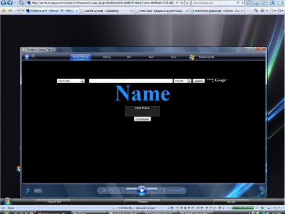
this layout looks so good but im using IE so its messed up but the screenshot looks pretty amazing! also from comments, i wish i could see what the pop up sections looked like =(

this layout works about as well as VISTA does. . .
Great job!

It works perfect in FF 1280x800... not IE though. Yeah, the pop up sections are neat. :)

It is a definitely a challenge and it will need some tweaking on the part of whomever dares to try to use it....very interesting...Hit me up when you do more....
I am gonna try this later. I just go thru reading everyone's comments and I honestly like to give stuff a try for myself because sometimes people dont put things in croeectly or play with it for a while and figure out what works.....I will give you feedback if it doesn't work or does work for me.....but I will definitely not criticize cuz I am still learnign myself....I can't wait to try it...the live preview looks very interesting....MUCH RESPECT

I think you had a good idea, it just didn't come through.
The pop up sections in it are really neat, but that's it. You should redo it though, and then resubmit. I make skins for SkinStudio on WindowBlinds 6 for Vista, and XP... what you could do is get into designing those, and make your own skin, submit it, then from the images you made the skin with, use to make a div overlay for MySpace with the pop up rollover navigation, add some clicking sounds for it, but not annoying ones, and maybe some animation, and wham, there you go. :)


its pretty much messed up overall. sorry. but it is creative from what i can tell from firefox. i like the rollovers but yeah it is misalign big time in both browsers.


Add Comment
You must be logged in to comment
Layout Details
| Designer |
MarcusBOOM
|
| Submitted on | May 30, 2008 |
| Page views | 30053 |
| Favorites | 74 |
| Comments | 13 |
| Reviewer |
highwayto4355
|
| Approved on | May 30, 2008 |