click! (comments)
Displaying 21 - 34 of 34 comments


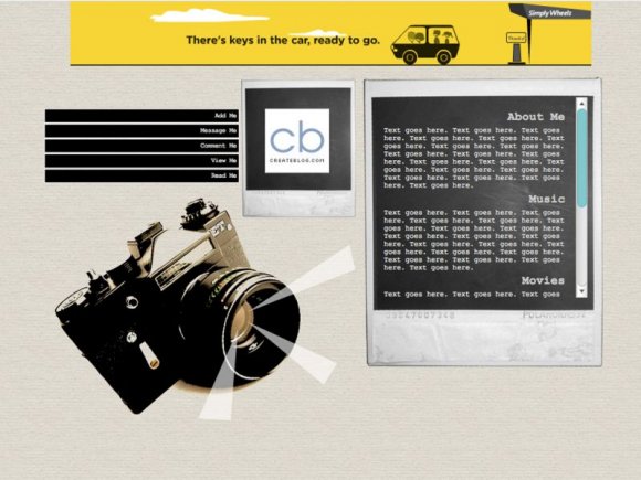
I really, really like the neutral-ish colors you used here. The way the camera balances out the empty space beneath the two smaller modules and then having the biggest module on the right is great.

this is soooo coool. i lovee it. &i love photography. amazing job.

but yeah i havin the same thing to ladarag. i checked in IE the the content area seems to be split and goes under the header image.


Wow. Very nice job. i really like the camera with the rays comming from the lens. nice photoshop job.
Very very nice, but the only thing I don't like is how there is a big empty space below the main part of the layout... it's just empty... gotta put somethin' there, or make it not scroll down like that, lol. Anyway, great job. FAV.


Add Comment
You must be logged in to comment
Layout Details
| Designer |
roxxtar
|
| Submitted on | May 25, 2008 |
| Page views | 36746 |
| Favorites | 362 |
| Comments | 34 |
| Reviewer |
highwayto4355
|
| Approved on | May 26, 2008 |